How To Create PP Chart Using xlChart+ Add-in?
Flowing these steps to create PP chart:

First, select data in the worksheet.

Click “PP Plot” item in “QQ PP Chart” menu in xlChart+ add-in, open “Create a PP Chart” dialog box.

Click “OK” button.

Flowing these steps to create PP chart:
First, select data in the worksheet.
Click “PP Plot” item in “QQ PP Chart” menu in xlChart+ add-in, open “Create a PP Chart” dialog box.
Click “OK” button.
Flowing these steps to create QQ chart:
First, select data in the worksheet.
Click “QQ Plot” item in “QQ PP Chart” menu in xlChart+ add-in, open “Create a QQ Chart” dialog box.

Click “OK” button.

Flowing these steps to create cloud rain chart:
First, select data in the worksheet.

Click “Cloud Rain Chart-Type 1” item in “Cloud Rain Chart” menu in xlChart+ add-in, open “Create a Cloudrain Chart” dialog box. Input “B1:B90” in “Grouped Range” textbox.

Click “OK” button.

You can change the type by selecting another item in “Type” dropbox in “Create a Cloudrain Chart” dialog box.


Flowing these steps to create violin chart:
First, select data in the worksheet.

Click “Violin Chart-Type 1” item in “Boxplot Chart” menu in xlChart+ add-in, open “Create a Violin Chart” dialog box. Input “B1:B90” in “Grouped Range” textbox.

Click “OK” button.

Select “Type 2” in “Type” dropbox in “Create a Boxplot” dialog box, click “ok” button.

Flowing these steps to create boxplot chart:
First, select data in the worksheet.

Click “Boxplot Chart-1 Color” item in “Boxplot Chart” menu in xlChart+ add-in, open “Create a Boxplot” dialog box. Input “B1:B90” in “Grouped Range” textbox.

Click “OK” button.

You can change the colormap by selecting another item in “Select a colormap” dropbox in “Create a Boxplot” dialog box.


Flowing these steps to create triangular square heatmap chart:
First, select data in the worksheet.

Click “Triangular Square Heatmap Chart” item in “Heatmap Chart” menu in xlChart+ add-in, open “Create a Heatmap Chart” dialog box.

Click “OK” button.

You can change the colormap by selecting another item in “Select a colormap” dropbox in “Create a Heatmap Chart” dialog box.
Flowing these steps to create square heatmap chart:
First, select data in the worksheet.
Click “Square Heatmap Chart” item in “Heatmap Chart” menu in xlChart+ add-in, open “Create a Heatmap Chart” dialog box.

Click “OK” button.

You can change the colormap by selecting another item in “Select a colormap” dropbox in “Create a Heatmap Chart” dialog box.


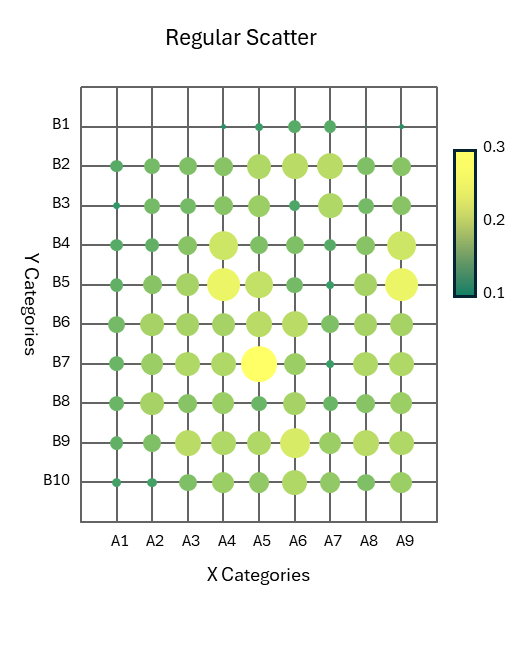
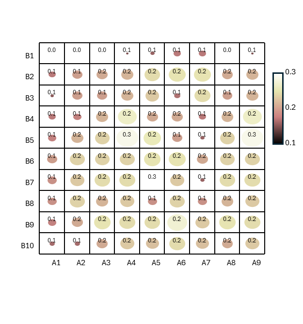
Flowing these steps to create heatmap chart:
First, select data in the worksheet.
Click “Circle Heatmap Chart” item in “Heatmap Chart” menu in xlChart+ add-in, open “Create a Heatmap Chart” dialog box.
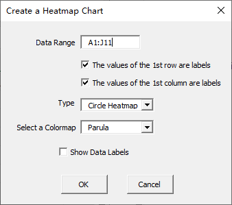
Click “OK” button.
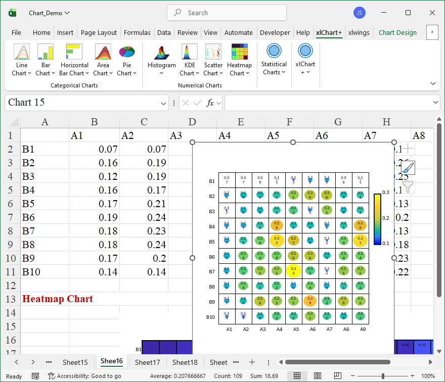
You can change the colormap by selecting another item in “Select a colormap” dropbox in “Create a Heatmap Chart” dialog box.
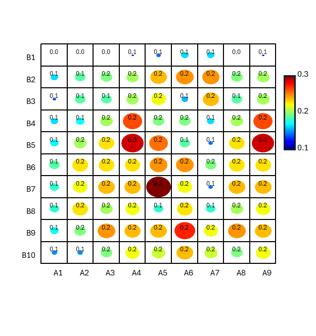
Flowing these steps to create heatmap chart:
First, select data in the worksheet.
Click “Normal Heatmap Chart” item in “Heatmap Chart” menu in xlChart+ add-in, open “Create a Heatmap Chart” dialog box.

Click “OK” button.
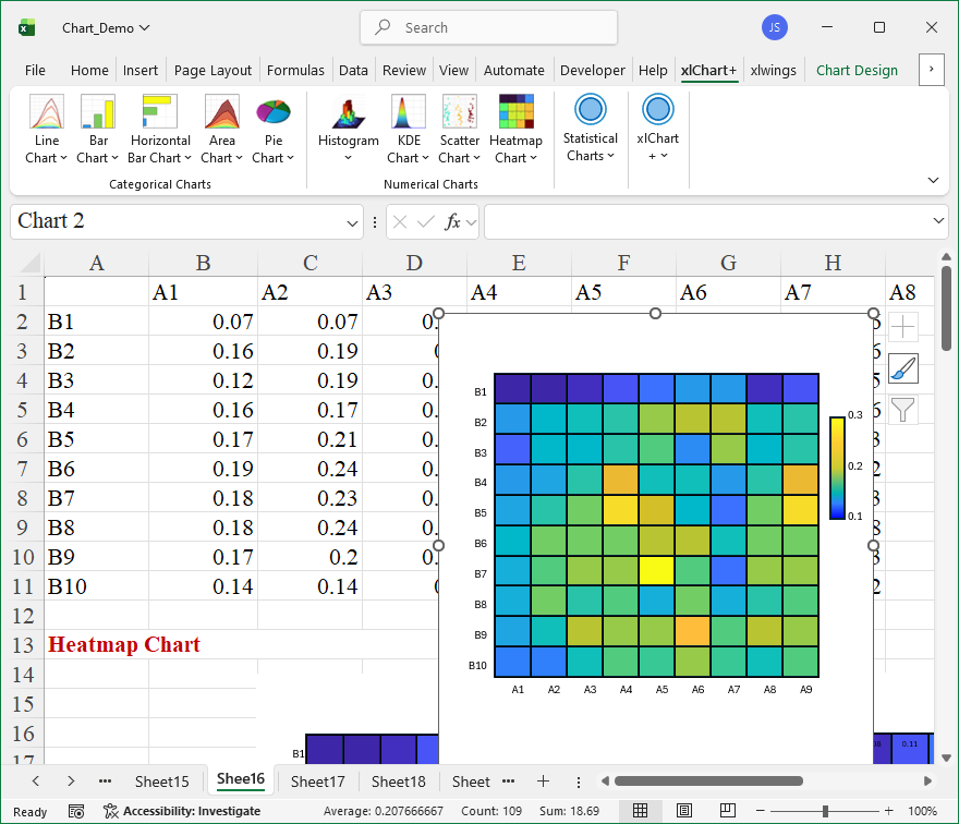
You can change the colormap by selecting another item in “Select a colormap” dropbox in “Create a Scatter Chart” dialog box.

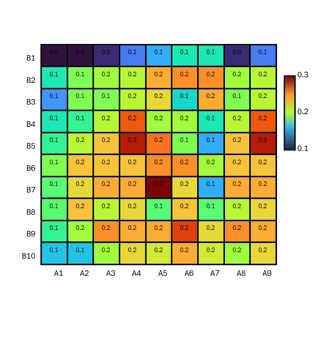

Flowing these steps to create regular scatter chart:
First, select data in the worksheet.
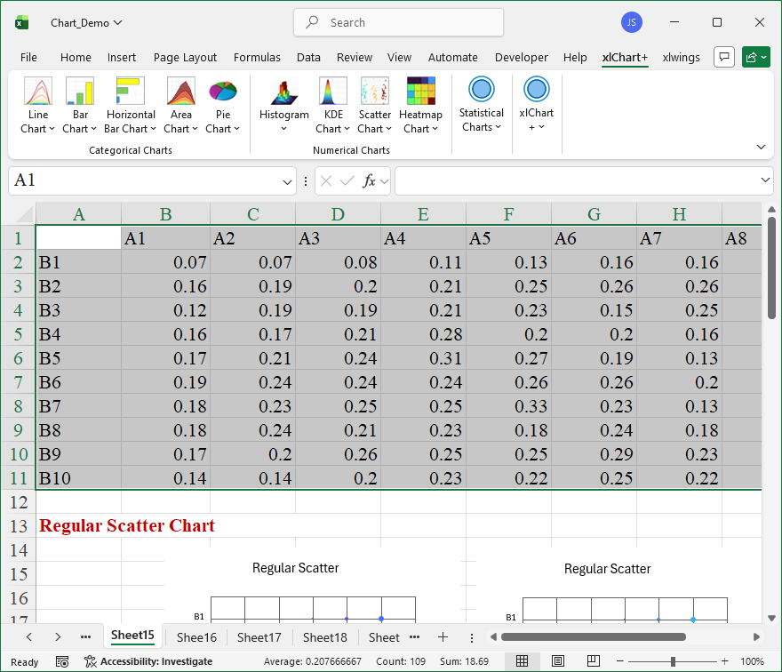
Click “Regular Scatter” item in “Scatter Chart” menu in xlChart+ add-in, open “Create a Regular Scatter Chart” dialog box.

Click “OK” button.

You can change the colormap by selecting another item in “Select a colormap” dropbox in “Create a Regular Scatter Chart” dialog box.