import xlwings as xw
import numpy as np
import os
def kde2(dt1,dt2,x,y,w):
#二元核密度估计
my_sum=0
count=0
for i in dt1:
for j in dt2:
#Gaussian核函数(2D)
my_sum+=np.exp(-((x-i)**2+(y-j)**2)/(2*w**2))/\
(2*3.1416*w**2)
count+=1
return my_sum/count
root=os.getcwd()
app=xw.App(visible=True,add_book=False)
wb=app.books.open(root+r'/data.xlsx',read_only=False)
sht=wb.sheets('Sheet1')
dt1=sht.range('A1:A200').value
dt2=sht.range('B1:B200').value
#用Shapes创建图表
kdex=[0 for _ in range(40)]
kdey=[0 for _ in range(40)]
kdef=[[0 for _ in range(40)] for _ in range(40)]
for i in range(40):
kdex[i]=(i- 20)/2
kdey[i]=(i- 20)/2
for i in range(40):
for j in range(40):
kdef[i][j]=kde2(dt1,dt2,kdex[i],kdey[j],1.5)
sht2=wb.sheets.add()
sht2.name='plot'
for i in range(40):
sht2.api.Cells(1, i+2).Value=kdex[i]
sht2.api.Cells(i+2, 1).Value=kdey[i]
for j in range(40):
sht2.api.Cells(i+2,j+2).Value=kdef[i][j]
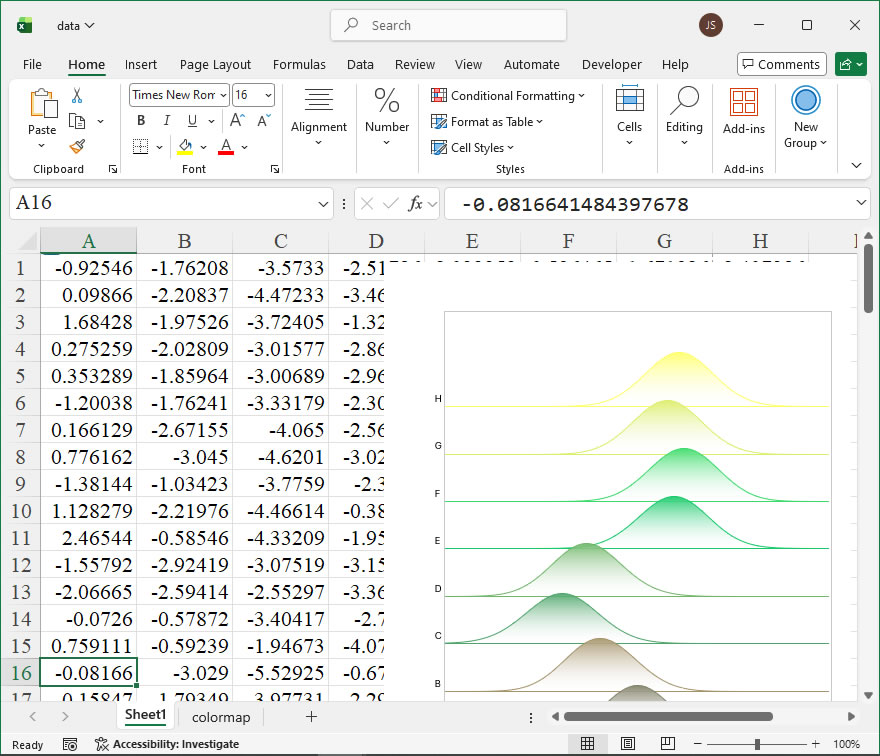
#创建曲面图表
shp=sht2.api.Shapes.AddChart2()
shp.Left=20
shp.Top=50
shp.Width=500
shp.Height=400
cht=shp.Chart
#设置图表数据范围
cht.SetSourceData(sht2.api.Range(sht2.api.Cells(2, 2),sht2.api.Cells(41, 41)))
#设置图表类型为三维曲面图
cht.ChartType=xw.constants.ChartType.xlSurface
#设置图表标题
cht.HasTitle=True
cht.ChartTitle.Text='Surface'
#设置轴标题
cht.Axes(1,1).HasTitle=True
cht.Axes(1,1).AxisTitle.Text='X Axis'
cht.Axes(3,1).HasTitle=True
cht.Axes(3,1).AxisTitle.Text='Y Axis'
cht.Axes(2,1).HasTitle=True
cht.Axes(2,1).AxisTitle.Text='Z Axis'
cht.Export(root+'/cht.jpg')
cht.Export(root+'/cht.svg')
cht.ExportAsFixedFormat(0,root+'/cht.pdf')
#wb.save()
#app.kill()
import xlwings as xw
import os
def set_style(cht):
cht.ChartArea.Format.Line.Visible=False
cht.PlotArea.Format.Fill.Visible = False
cht.PlotArea.Format.Line.Visible = True
cht.PlotArea.Format.Line.ForeColor.RGB=xw.utils.rgb_to_int((200,200,200))
ax1 = cht.Axes(1)
ax2 = cht.Axes(2)
ax1.HasTitle = True
ax1.AxisTitle.Text = 'Categories'
ax1.AxisTitle.Font.Size = 10
ax1.TickLabels.Font.Size = 8
#ax1.TickLabels.NumberFormat = '0.00'
ax1.HasMajorGridlines = False
ax2.HasTitle = True
ax2.AxisTitle.Text = 'Values'
ax2.AxisTitle.Font.Size = 10
ax2.TickLabels.Font.Size = 8
ax2.HasMajorGridlines = False
cht.HasTitle = True
#cht.ChartTitle.Caption = 'Plot'
#cht.ChartTitle.Font.Size = 12
root=os.getcwd()
app=xw.App(visible=True,add_book=False)
wb=app.books.open(root+r'/data.xlsx',read_only=False)
sht=wb.sheets('Sheet1')
x=sht.range('A1:A1000').value
y=sht.range('B1:B1000').value
#频数分析
bx=10
by=10
minx=9999
maxx=-9999
miny=9999
maxy=-9999
for i in range(1000):
if minx>x[i]: minx=x[i]
if maxx<x[i]: maxx=x[i]
if miny>y[i]: miny=y[i]
if maxy<y[i]: maxy=y[i]
difx=maxx-minx
dify=maxy-miny
stepx=difx/bx
stepy=dify/by
count=[[0 for _ in range(10)] for _ in range(10)]
xi=[0 for _ in range(11)]
xi2=[0 for _ in range(11)]
xi[0]=minx
xi2[0]=minx+stepx/2
for i in range(1,11):
xi[i]=xi[i-1]+stepx
if i!=10:
xi2[i]=xi[i]+stepx/2
yi=[0 for _ in range(11)]
yi2=[0 for _ in range(11)]
yi[0]=miny
yi2[0]=miny+stepy/2
for i in range(1,11):
yi[i]=yi[i-1]+stepy
if i!=10:
yi2[i]=yi[i]+stepy/2
for k in range(1000):
for i in range(10):
if x[k]>=xi[i] and x[k]<xi[i+1]:
for j in range(10):
if y[k]>=yi[j] and y[k]<yi[j+1]:
count[i][j]+=1
#输出频数到sheet2
sht2=wb.sheets.add()
for i in range(1,11):
for j in range(1,11):
sht2.api.Cells(i+1,j+1).Value=count[i-1][j-1]
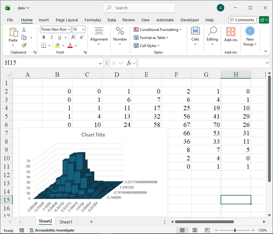
#根据频数绘制二元直方图
shp=sht2.api.Shapes.AddChart2(286,xw.constants.ChartType.xl3DColumn)
shp.Left=20
cht=shp.Chart
if cht.SeriesCollection().Count>0:
for i in range(cht.SeriesCollection().Count,0,-1):
cht.SeriesCollection(i).Delete()
cht.Legend.Delete()
countj=[0 for _ in range(10)]
for i in range(10):
countj[i]=count[i][:]
cht.SeriesCollection().NewSeries()
cht.SeriesCollection(i+1).Name=str(yi2[i]) #序列轴刻度标签
cht.SeriesCollection(i+1).XValues=xi2 #分类轴刻度标签
cht.SeriesCollection(i+1).Values=countj[i] #Z轴
cht.ChartGroups(1).GapWidth=0
cht.GapDepth=0
for i in range(10):
fl=cht.SeriesCollection(i+1).Format.Fill
fl.ForeColor.ObjectThemeColor=5 #msoThemeColorAccent1
#fl.ForeColor.TintAndShade = 0
fl.ForeColor.Brightness=0
fl.Solid()
ln=cht.SeriesCollection(i+1).Format.Line
ln.Visible=True
ln.ForeColor.ObjectThemeColor=13 #msoThemeColorText1
#ln.ForeColor.TintAndShade = 0
ln.ForeColor.Brightness=0.0500000007
cht.Export(root+'/cht.jpg')
cht.Export(root+'/cht.svg')
cht.ExportAsFixedFormat(0,root+'/cht.pdf')
#wb.save()
#app.kill()