Archive

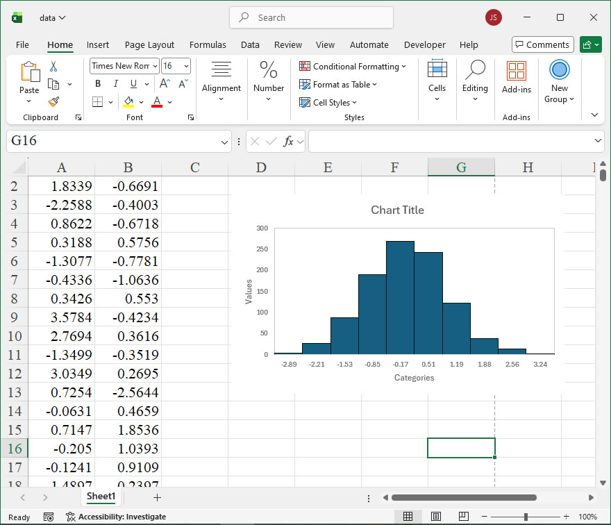
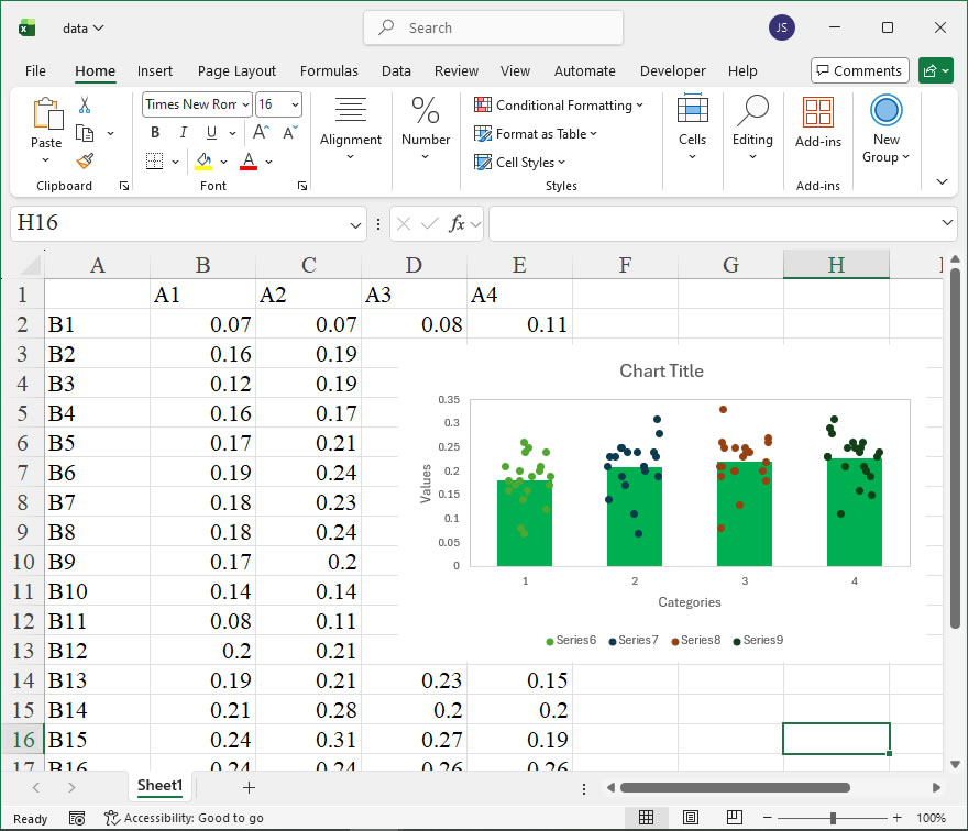
How To Create Univariate Histogram Using xlwings?
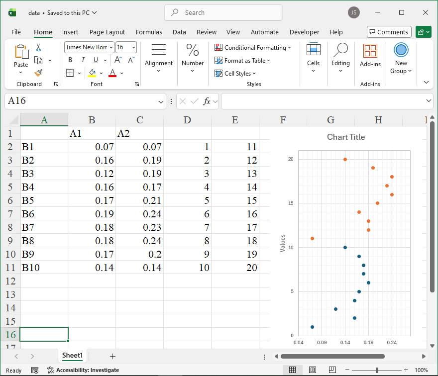
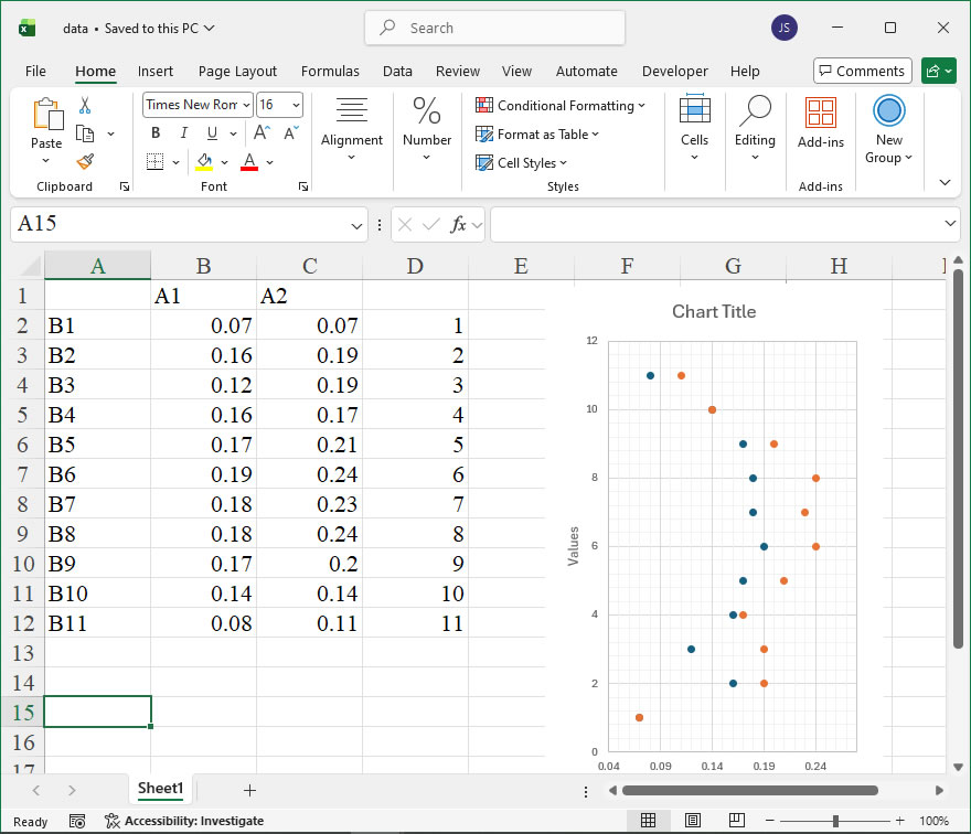
Example

Code

import xlwings as xw
import os

def set_style(cht):
    cht.ChartArea.Format.Line.Visible=False
    cht.PlotArea.Format.Fill.Visible = False
    cht.PlotArea.Format.Line.Visible = True
    cht.PlotArea.Format.Line.ForeColor.RGB=xw.utils.rgb_to_int((200,200,200))
    #cht.PlotArea.Format.Line.ForeColor.ObjectThemeColor = msoThemeColorText1
    ax1 = cht.Axes(1)
    ax2 = cht.Axes(2)
    ax1.HasTitle = True
    ax1.AxisTitle.Text = 'Categories'
    ax1.AxisTitle.Font.Size = 10
    ax1.TickLabels.Font.Size = 8
    ax1.TickLabels.NumberFormat = '0.00'
    ax1.HasMajorGridlines = False
    ax2.HasTitle = True
    ax2.AxisTitle.Text = 'Values'
    ax2.AxisTitle.Font.Size = 10
    ax2.TickLabels.Font.Size = 8
    ax2.HasMajorGridlines = False
    cht.HasTitle = True
    #cht.ChartTitle.Caption = 'Plot'
    #cht.ChartTitle.Font.Size = 12

def draw_hist(sht,n):
    #频数分析
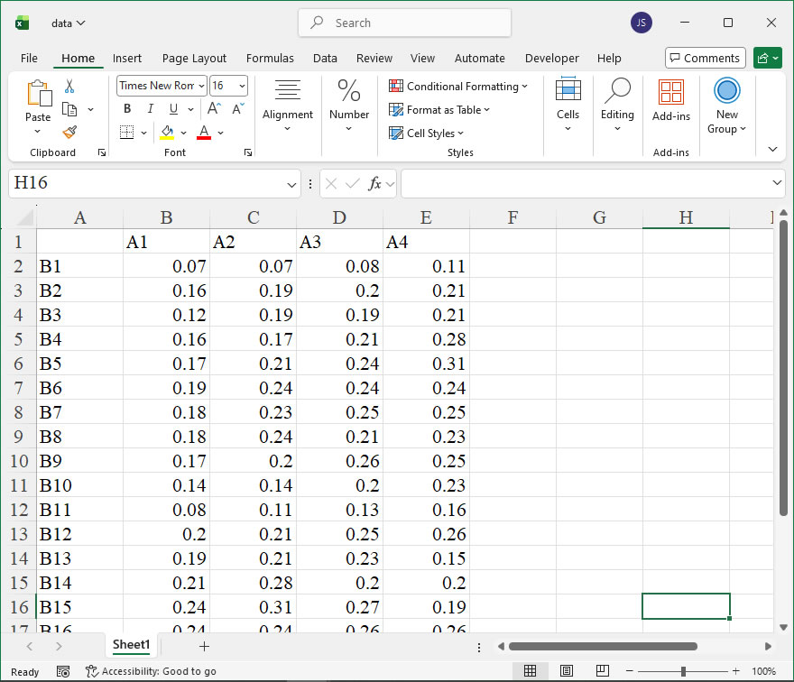
    x=sht.range('A1:A1000').value
    xi=[0 for _ in range(11)]
    xi2=[0 for _ in range(10)]
    count=[0 for _ in range(10)]
    bx=10
    minx=9999
    maxx=-9999
    for i in range(n):
        if minx>x[i]:
            minx=x[i]
        if maxx<x[i]:
            maxx=x[i]
    difx=maxx-minx
    stepx=difx/bx
    for i in range(10):
        count[i]=0
    xi[0]=minx
    xi2[0]=minx+stepx/2
    for i in range(1,11):
        xi[i]=xi[i-1]+stepx
        if i!=10:
            xi2[i]=xi[i]+stepx/2 
    for i in range(n):
        for j in range(10):
            if x[i]>=xi[j] and x[i]<xi[j+1]:
                count[j]+=1

    #根据频数绘制直方图
    sht.api.Range('D3').Select()
    shp=sht.api.Shapes.AddChart2()
    shp.Left=20
    cht=shp.Chart
    for i in range(cht.SeriesCollection().Count,0,-1):
        cht.SeriesCollection(i).Delete()

    cht.SeriesCollection().NewSeries()
    cht.SeriesCollection(1).ChartType=xw.constants.ChartType.xlColumnClustered
    cht.SeriesCollection(1).XValues=xi2
    cht.SeriesCollection(1).Values=count
    cht.ChartGroups(1).GapWidth=0
    cht.GapDepth=0
    
    fl=cht.SeriesCollection(1).Format.Fill
    fl.ForeColor.ObjectThemeColor=5    #msoThemeColorAccent1
    #fl.ForeColor.TintAndShade=0
    fl.ForeColor.Brightness=0
    fl.Solid()

    ln=cht.SeriesCollection(1).Format.Line
    ln.Visible=True
    ln.ForeColor.ObjectThemeColor=13    #msoThemeColorText1
    #ln.ForeColor.TintAndShade=0
    ln.ForeColor.Brightness=0.0500000007
  
    return cht

root=os.getcwd()
app=xw.App(visible=True,add_book=False)
wb=app.books.open(root+r'/data.xlsx',read_only=False)
sht=wb.sheets('Sheet1')
cht=draw_hist(sht,1000)
set_style(cht)

cht.Export(root+'/cht.jpg')
cht.Export(root+'/cht.svg')
cht.ExportAsFixedFormat(0,root+'/cht.pdf')

#wb.save()
#app.kill()

How To Create Lollipop Plot Using xlwings?

Example

Code

import xlwings as xw
import numpy as np
import os

def set_style(cht):
    cht.ChartArea.Format.Line.Visible=False
    cht.PlotArea.Format.Fill.Visible = False
    cht.PlotArea.Format.Line.Visible = True
    cht.PlotArea.Format.Line.ForeColor.RGB=xw.utils.rgb_to_int((200,200,200))
    #cht.PlotArea.Format.Line.ForeColor.ObjectThemeColor = msoThemeColorText1
    ax1 = cht.Axes(1)
    ax2 = cht.Axes(2)
    ax1.HasTitle = True
    ax1.AxisTitle.Text = 'Values'
    ax1.AxisTitle.Font.Size = 10
    ax1.TickLabels.Font.Size = 8
    #ax1.TickLabels.NumberFormat = '0.00'
    ax1.HasMajorGridlines = True
    ax1.HasMinorGridlines = True
    ax2.HasTitle = True
    ax2.AxisTitle.Text = 'Categories'
    ax2.AxisTitle.Font.Size = 10
    ax2.TickLabels.Font.Size = 8
    ax2.HasMajorGridlines = True
    ax2.HasMinorGridlines = True
    cht.HasTitle = True
    #cht.ChartTitle.Caption = 'Plot'
    #cht.ChartTitle.Font.Size = 12

def draw_rnd_scatter(cht,x,y,n,r,g,b):
    '''绘制散点图
    x: X坐标    y(0 to n-1): Y坐标
    '''
    ser=cht.SeriesCollection().NewSeries()
    ser.ChartType=xw.constants.ChartType.xlXYScatter
    ser.XValues=x
    ser.Values=y
    ser.Format.Line.ForeColor.RGB=xw.utils.rgb_to_int((0,0,0))
    ser.Format.Fill.ForeColor.RGB=xw.utils.rgb_to_int((r,g,b))
    ser.MarkerSize=22
    for i in range(n):
        lf=shape_x(cht,x[i]-0.04)
        tp=shape_y(cht,y[i]+0.3)
        wd=cht.PlotArea.InsideWidth/(cht.Axes(1).MaximumScale-cht.Axes(1).MinimumScale)*0.08
        ht=cht.PlotArea.InsideHeight/(cht.Axes(2).MaximumScale-cht.Axes(2).MinimumScale)*0.6
        shp=cht.Shapes.AddLabel(1,lf,tp,wd,ht)
        shp.TextFrame2.TextRange.Characters.Text=str(x[i])
        shp.TextFrame2.TextRange.Characters.Font.Size=8
        shp.TextFrame.HorizontalAlignment=xw.constants.HAlign.xlHAlignCenter
        shp.TextFrame.VerticalAlignment=xw.constants.VAlign.xlVAlignCenter


root=os.getcwd()
app=xw.App(visible=True,add_book=False)
wb=app.books.open(root+r'/data.xlsx',read_only=False)
sht=wb.sheets('Sheet1')

shp=sht.api.Shapes.AddChart2()
shp.Left=20
shp.Top=20
shp.Width=220
shp.Height=320
cht=shp.Chart    #添加图表
cht.ChartType=xw.constants.ChartType.xlXYScatter
ax1=cht.Axes(1)
ax2=cht.Axes(2)
ax1.MinimumScale=0
ax1.MaximumScale=0.28
ax2.MinimumScale=0
ax2.MaximumScale=11

set_style(cht)

data=sht.range('B2:C11').value
dt=np.transpose(data)
dt1=dt[0]
dt2=dt[1]

#绘线形图
for i in range(10):
    ser=cht.SeriesCollection().NewSeries()
    ser.ChartType=xw.constants.ChartType.xlXYScatterLinesNoMarkers
    ser.XValues=[0,dt1[i]]
    ser.Values=[dt2[i],dt2[i]]
    ser.Format.Line.ForeColor.RGB=xw.utils.rgb_to_int((0,0,255))
    ser.Format.Line.Weight=1
  
#绘散点图
draw_rnd_scatter(cht,dt1,dt2,10,255,128,0)

cht.HasLegend=False

cht.Export(root+'/cht.jpg')
cht.Export(root+'/cht.svg')
cht.ExportAsFixedFormat(0,root+'/cht.pdf')

#wb.save()
#app.kill()

How To Create Stem Chart Using xlwings?

Example

Code

import xlwings as xw
import numpy as np
import os

def set_style(cht):
    cht.ChartArea.Format.Line.Visible=False
    cht.PlotArea.Format.Fill.Visible = False
    cht.PlotArea.Format.Line.Visible = True
    cht.PlotArea.Format.Line.ForeColor.RGB=xw.utils.rgb_to_int((200,200,200))
    #cht.PlotArea.Format.Line.ForeColor.ObjectThemeColor = msoThemeColorText1
    ax1 = cht.Axes(1)
    ax2 = cht.Axes(2)
    ax1.HasTitle = True
    ax1.AxisTitle.Text = 'Values'
    ax1.AxisTitle.Font.Size = 10
    ax1.TickLabels.Font.Size = 8
    #ax1.TickLabels.NumberFormat = '0.00'
    ax1.HasMajorGridlines = True
    ax1.HasMinorGridlines = True
    ax2.HasTitle = True
    ax2.AxisTitle.Text = 'Categories'
    ax2.AxisTitle.Font.Size = 10
    ax2.TickLabels.Font.Size = 8
    ax2.HasMajorGridlines = True
    ax2.HasMinorGridlines = True
    cht.HasTitle = True
    #cht.ChartTitle.Caption = 'Plot'
    #cht.ChartTitle.Font.Size = 12

def draw_rnd_scatter(cht,x,y,r,g,b):
    '''绘制散点图
    x: X坐标    y(0 to n-1): Y坐标
    '''
    ser=cht.SeriesCollection().NewSeries()
    ser.ChartType=xw.constants.ChartType.xlXYScatter
    ser.XValues=x
    ser.Values=y
    ser.Format.Line.ForeColor.RGB=xw.utils.rgb_to_int((0,0,0))
    ser.Format.Fill.ForeColor.RGB=xw.utils.rgb_to_int((r,g,b))
    ser.MarkerSize=6    


root=os.getcwd()
app=xw.App(visible=True,add_book=False)
wb=app.books.open(root+r'/data.xlsx',read_only=False)
sht=wb.sheets('Sheet1')

shp=sht.api.Shapes.AddChart2()
shp.Left=20
shp.Top=20
shp.Width=220
shp.Height=320
cht=shp.Chart    #添加图表
cht.ChartType=xw.constants.ChartType.xlXYScatter
ax1=cht.Axes(1)
ax2=cht.Axes(2)
ax1.MinimumScale=0
ax1.MaximumScale=0.3
ax2.MinimumScale=0
ax2.MaximumScale=16

set_style(cht)

data=sht.range('B2:C16').value
dt=np.transpose(data)
dt1=dt[0]
dt2=dt[1]

#绘线形图
for i in range(15):
    ser=cht.SeriesCollection().NewSeries()
    ser.ChartType=xw.constants.ChartType.xlXYScatterLinesNoMarkers
    ser.XValues=[0,dt1[i]]
    ser.Values=[dt2[i],dt2[i]]
    ser.Format.Line.ForeColor.RGB=xw.utils.rgb_to_int((0,0,255))
    ser.Format.Line.Weight=1
  
#绘散点图
draw_rnd_scatter(cht,dt1,dt2,0,0,255)

cht.HasLegend=False

cht.Export(root+'/cht.jpg')
cht.Export(root+'/cht.svg')
cht.ExportAsFixedFormat(0,root+'/cht.pdf')

#wb.save()
#app.kill()

How To Create Dumbbell Plot Using xlwings?

Example

Code

import xlwings as xw
import numpy as np
import os

def set_style(cht):
    cht.ChartArea.Format.Line.Visible=False
    cht.PlotArea.Format.Fill.Visible = False
    cht.PlotArea.Format.Line.Visible = True
    cht.PlotArea.Format.Line.ForeColor.RGB=xw.utils.rgb_to_int((200,200,200))
    #cht.PlotArea.Format.Line.ForeColor.ObjectThemeColor = msoThemeColorText1
    ax1 = cht.Axes(1)
    ax2 = cht.Axes(2)
    ax1.HasTitle = True
    ax1.AxisTitle.Text = 'Values'
    ax1.AxisTitle.Font.Size = 10
    ax1.TickLabels.Font.Size = 8
    #ax1.TickLabels.NumberFormat = '0.00'
    ax1.HasMajorGridlines = True
    ax1.HasMinorGridlines = True
    ax2.HasTitle = True
    ax2.AxisTitle.Text = 'Categories'
    ax2.AxisTitle.Font.Size = 10
    ax2.TickLabels.Font.Size = 8
    ax2.HasMajorGridlines = True
    ax2.HasMinorGridlines = True
    cht.HasTitle = True
    #cht.ChartTitle.Caption = 'Plot'
    #cht.ChartTitle.Font.Size = 12

def draw_rnd_scatter(cht,x,y,r,g,b):
    '''绘制散点图
    x: X坐标    y(0 to n-1): Y坐标
    '''
    ser=cht.SeriesCollection().NewSeries()
    ser.ChartType=xw.constants.ChartType.xlXYScatter
    ser.XValues=x
    ser.Values=y
    ser.Format.Line.ForeColor.RGB=xw.utils.rgb_to_int((r,g,b))
    ser.Format.Fill.ForeColor.RGB=xw.utils.rgb_to_int((r,g,b))
    ser.MarkerSize=6    


root=os.getcwd()
app=xw.App(visible=True,add_book=False)
wb=app.books.open(root+r'/data.xlsx',read_only=False)
sht=wb.sheets('Sheet1')

shp=sht.api.Shapes.AddChart2()
shp.Left=20
shp.Top=20
shp.Width=250
shp.Height=320
cht=shp.Chart    #添加图表
cht.ChartType=xw.constants.ChartType.xlXYScatter
ax1=cht.Axes(1)
ax2=cht.Axes(2)
ax1.MinimumScale=0
ax1.MaximumScale=0.25
ax2.MinimumScale=0
ax2.MaximumScale=11

set_style(cht)

data=sht.range('B2:D11').value
dt=np.transpose(data)
dt1=dt[0]
dt2=dt[1]
dt3=dt[2]

#绘线形图
for i in range(10):
    ser=cht.SeriesCollection().NewSeries()
    ser.ChartType=xw.constants.ChartType.xlXYScatterLinesNoMarkers
    ser.XValues=[dt1[i],dt2[i]]
    ser.Values=[dt3[i],dt3[i]]
    ser.Format.Line.ForeColor.RGB=xw.utils.rgb_to_int((0,0,255))
    ser.Format.Line.Weight=1.5
  
#绘散点图
draw_rnd_scatter(cht,dt1,dt3,0,0,255)
draw_rnd_scatter(cht,dt2,dt3,255,128,0)

cht.Export(root+'/cht.jpg')
cht.Export(root+'/cht.svg')
cht.ExportAsFixedFormat(0,root+'/cht.pdf')

#wb.save()
#app.kill()

How To Create Sliding Bead Chart Using xlwings? 3

Example

Code

import xlwings as xw
import os

def set_style(cht):
    cht.ChartArea.Format.Line.Visible=False
    cht.PlotArea.Format.Fill.Visible = False
    cht.PlotArea.Format.Line.Visible = True
    cht.PlotArea.Format.Line.ForeColor.RGB=xw.utils.rgb_to_int((200,200,200))
    #cht.PlotArea.Format.Line.ForeColor.ObjectThemeColor = msoThemeColorText1
    ax1 = cht.Axes(1)
    ax2 = cht.Axes(2)
    ax1.HasTitle = True
    ax1.AxisTitle.Text = 'Categories'
    ax1.AxisTitle.Font.Size = 10
    ax1.TickLabels.Font.Size = 8
    #ax1.TickLabels.NumberFormat = '0.00'
    ax1.HasMajorGridlines = True
    ax1.HasMinorGridlines = True
    ax2.HasTitle = True
    ax2.AxisTitle.Text = 'Values'
    ax2.AxisTitle.Font.Size = 10
    ax2.TickLabels.Font.Size = 8
    ax2.HasMajorGridlines = True
    ax2.HasMinorGridlines = True
    cht.HasTitle = True
    #cht.ChartTitle.Caption = 'Plot'
    #cht.ChartTitle.Font.Size = 12

root=os.getcwd()
app=xw.App(visible=True,add_book=False)
wb=app.books.open(root+r'/data.xlsx',read_only=False)
sht=wb.sheets('Sheet1')

sht.api.Range('B2:C11').Select()  #数据
shp=sht.api.Shapes.AddChart2(-1, xw.constants.ChartType.xlXYScatter, 30, 20, 230, 380, True)
cht=shp.Chart  #添加图表

count=cht.SeriesCollection().Count
if count>0:
    for i in range(count,0,-1):
        cht.SeriesCollection(i).Delete()

cht.SeriesCollection().NewSeries()
cht.SeriesCollection(1).ChartType=xw.constants.ChartType.xlXYScatter
cht.SeriesCollection(1).XValues=sht.api.Range("B2:B11")
cht.SeriesCollection(1).Values=sht.api.Range("D2:D11")
  
cht.SeriesCollection().NewSeries()
cht.SeriesCollection(2).ChartType=xw.constants.ChartType.xlXYScatter
cht.SeriesCollection(2).XValues=sht.api.Range("C2:C11")
cht.SeriesCollection(2).Values=sht.api.Range("E2:E11")

cht.Axes(1).MinimumScale=0.04
cht.Axes(1).MaximumScale=0.28
cht.Axes(2).MinimumScale=0
cht.Axes(2).MaximumScale=21

set_style(cht)

cht.Export(root+'/cht.jpg')
cht.Export(root+'/cht.svg')
cht.ExportAsFixedFormat(0,root+'/cht.pdf')

#wb.save()
#app.kill()

How To Create Sliding Bead Chart Using xlwings? 2

Example

Code

import xlwings as xw
import os

def set_style(cht):
    cht.ChartArea.Format.Line.Visible=False
    cht.PlotArea.Format.Fill.Visible = False
    cht.PlotArea.Format.Line.Visible = True
    cht.PlotArea.Format.Line.ForeColor.RGB=xw.utils.rgb_to_int((200,200,200))
    #cht.PlotArea.Format.Line.ForeColor.ObjectThemeColor = msoThemeColorText1
    ax1 = cht.Axes(1)
    ax2 = cht.Axes(2)
    ax1.HasTitle = True
    ax1.AxisTitle.Text = 'Categories'
    ax1.AxisTitle.Font.Size = 10
    ax1.TickLabels.Font.Size = 8
    #ax1.TickLabels.NumberFormat = '0.00'
    ax1.HasMajorGridlines = True
    ax1.HasMinorGridlines = True
    ax2.HasTitle = True
    ax2.AxisTitle.Text = 'Values'
    ax2.AxisTitle.Font.Size = 10
    ax2.TickLabels.Font.Size = 8
    ax2.HasMajorGridlines = True
    ax2.HasMinorGridlines = True
    cht.HasTitle = True
    #cht.ChartTitle.Caption = 'Plot'
    #cht.ChartTitle.Font.Size = 12

root=os.getcwd()
app=xw.App(visible=True,add_book=False)
wb=app.books.open(root+r'/data.xlsx',read_only=False)
sht=wb.sheets('Sheet1')

sht.api.Range('B2:C12').Select()  #数据
shp=sht.api.Shapes.AddChart2(-1, xw.constants.ChartType.xlXYScatter, 30, 20, 230, 380, True)
cht=shp.Chart  #添加图表

count=cht.SeriesCollection().Count
if count>0:
    for i in range(count,0,-1):
        cht.SeriesCollection(i).Delete()

cht.SeriesCollection().NewSeries()
cht.SeriesCollection(1).ChartType=xw.constants.ChartType.xlXYScatter
cht.SeriesCollection(1).XValues=sht.api.Range("B2:B12")
cht.SeriesCollection(1).Values=sht.api.Range("D2:D12")
  
cht.SeriesCollection().NewSeries()
cht.SeriesCollection(2).ChartType=xw.constants.ChartType.xlXYScatter
cht.SeriesCollection(2).XValues=sht.api.Range("C2:C12")
cht.SeriesCollection(2).Values=sht.api.Range("D2:D12")

cht.Axes(1).MinimumScale=0.04
cht.Axes(1).MaximumScale=0.28
cht.Axes(2).MinimumScale=0
cht.Axes(2).MaximumScale=12

set_style(cht)

cht.Export(root+'/cht.jpg')
cht.Export(root+'/cht.svg')
cht.ExportAsFixedFormat(0,root+'/cht.pdf')

#wb.save()
#app.kill()

How To Create Sliding Bead Chart Using xlwings?

Example

Code

import xlwings as xw
import os

def set_style(cht):
    cht.ChartArea.Format.Line.Visible=False
    cht.PlotArea.Format.Fill.Visible = False
    cht.PlotArea.Format.Line.Visible = True
    cht.PlotArea.Format.Line.ForeColor.RGB=xw.utils.rgb_to_int((200,200,200))
    #cht.PlotArea.Format.Line.ForeColor.ObjectThemeColor = msoThemeColorText1
    ax1 = cht.Axes(1)
    ax2 = cht.Axes(2)
    ax1.HasTitle = True
    ax1.AxisTitle.Text = 'Categories'
    ax1.AxisTitle.Font.Size = 10
    ax1.TickLabels.Font.Size = 8
    #ax1.TickLabels.NumberFormat = '0.00'
    ax1.HasMajorGridlines = True
    ax1.HasMinorGridlines = True
    ax2.HasTitle = True
    ax2.AxisTitle.Text = 'Values'
    ax2.AxisTitle.Font.Size = 10
    ax2.TickLabels.Font.Size = 8
    ax2.HasMajorGridlines = True
    ax2.HasMinorGridlines = True
    cht.HasTitle = True
    #cht.ChartTitle.Caption = 'Plot'
    #cht.ChartTitle.Font.Size = 12

root=os.getcwd()
app=xw.App(visible=True,add_book=False)
wb=app.books.open(root+r'/data.xlsx',read_only=False)
sht=wb.sheets('Sheet1')

sht.api.Range('B2:C11').Select()  #数据
shp=sht.api.Shapes.AddChart2(-1,xw.constants.ChartType.xlXYScatter,30,20,200,300,True)
cht=shp.Chart  #添加图表
cht.Axes(1).MinimumScale=0.04
cht.Axes(1).MaximumScale=0.22
cht.Axes(2).MinimumScale=0
cht.Axes(2).MaximumScale=11

set_style(cht)

cht.Export(root+'/cht.jpg')
cht.Export(root+'/cht.svg')
cht.ExportAsFixedFormat(0,root+'/cht.pdf')

#wb.save()
#app.kill()

How To Set Geometric Transformations of Images Using xlwings?

Example

Code

import xlwings as xw
import os

def set_style(cht):
    cht.ChartArea.Format.Line.Visible=False
    cht.PlotArea.Format.Fill.Visible = False
    cht.PlotArea.Format.Line.Visible = True
    cht.PlotArea.Format.Line.ForeColor.RGB=xw.utils.rgb_to_int((200,200,200))
    #cht.PlotArea.Format.Line.ForeColor.ObjectThemeColor = msoThemeColorText1
    ax1 = cht.Axes(1)
    ax2 = cht.Axes(2)
    ax1.HasTitle = True
    ax1.AxisTitle.Text = 'Categories'
    ax1.AxisTitle.Font.Size = 10
    ax1.TickLabels.Font.Size = 8
    #ax1.TickLabels.NumberFormat = '0.00'
    ax1.HasMajorGridlines = False
    ax2.HasTitle = True
    ax2.AxisTitle.Text = 'Values'
    ax2.AxisTitle.Font.Size = 10
    ax2.TickLabels.Font.Size = 8
    ax2.HasMajorGridlines = False
    cht.HasTitle = True
    #cht.ChartTitle.Caption = 'Plot'
    #cht.ChartTitle.Font.Size = 12

root=os.getcwd()
app=xw.App(visible=True,add_book=False)
wb=app.books.open(root+r'/data.xlsx',read_only=False)
sht=wb.sheets('Sheet1')

shp=sht.api.Shapes.AddChart2()
shp.Left=20
cht=shp.Chart
cht.ChartType=xw.constants.ChartType.xlXYScatter
ax1=cht.Axes(1)
ax2=cht.Axes(2)
ax1.MinimumScale=0
ax1.MaximumScale=250
ax2.MinimumScale=0
ax2.MaximumScale=200

set_style(cht)

cht.SeriesCollection().NewSeries()

shp2=cht.Shapes.AddPicture(r'd:\picpy.jpg',True,True,100,50,100,100)
shp2.IncrementRotation(30)
shp2.Flip(0)

#wb.save()
#app.kill()

How To Add Image To a Chart Using xlwings?

Example

Code

import xlwings as xw
import os

def set_style(cht):
    cht.ChartArea.Format.Line.Visible=False
    cht.PlotArea.Format.Fill.Visible = False
    cht.PlotArea.Format.Line.Visible = True
    cht.PlotArea.Format.Line.ForeColor.RGB=xw.utils.rgb_to_int((200,200,200))
    #cht.PlotArea.Format.Line.ForeColor.ObjectThemeColor = msoThemeColorText1
    ax1 = cht.Axes(1)
    ax2 = cht.Axes(2)
    ax1.HasTitle = True
    ax1.AxisTitle.Text = 'Categories'
    ax1.AxisTitle.Font.Size = 10
    ax1.TickLabels.Font.Size = 8
    #ax1.TickLabels.NumberFormat = '0.00'
    ax1.HasMajorGridlines = False
    ax2.HasTitle = True
    ax2.AxisTitle.Text = 'Values'
    ax2.AxisTitle.Font.Size = 10
    ax2.TickLabels.Font.Size = 8
    ax2.HasMajorGridlines = False
    cht.HasTitle = True
    #cht.ChartTitle.Caption = 'Plot'
    #cht.ChartTitle.Font.Size = 12


root = os.getcwd()
app = xw.App(visible=True, add_book=False)
wb=app.books.open(root+r'/data.xlsx',read_only=False)
sht=wb.sheets('Sheet1')

shp=sht.api.Shapes.AddChart2()
shp.Left=20
cht=shp.Chart
cht.ChartType=xw.constants.ChartType.xlXYScatter
ax1=cht.Axes(1)
ax2=cht.Axes(2)
ax1.MinimumScale=0
ax1.MaximumScale=250
ax2.MinimumScale=0
ax2.MaximumScale=200

set_style(cht)

cht.SeriesCollection().NewSeries()

cht.Shapes.AddPicture(r'd:\picpy.jpg',True,True,100,50,100,100)

#wb.save()
#app.kill()

How To Create New Chart: Combine Existing Charts Using xlwings?

Example

Code

import xlwings as xw
import numpy as np
import os

def set_style(cht):
    cht.ChartArea.Format.Line.Visible=False
    cht.PlotArea.Format.Fill.Visible = False
    cht.PlotArea.Format.Line.Visible = True
    cht.PlotArea.Format.Line.ForeColor.RGB=xw.utils.rgb_to_int((200,200,200))
    #cht.PlotArea.Format.Line.ForeColor.ObjectThemeColor = msoThemeColorText1
    ax1 = cht.Axes(1)
    ax2 = cht.Axes(2)
    ax1.HasTitle = True
    ax1.AxisTitle.Text = 'Categories'
    ax1.AxisTitle.Font.Size = 10
    ax1.TickLabels.Font.Size = 8
    #ax1.TickLabels.NumberFormat = '0.00'
    ax1.HasMajorGridlines = False
    ax2.HasTitle = True
    ax2.AxisTitle.Text = 'Values'
    ax2.AxisTitle.Font.Size = 10
    ax2.TickLabels.Font.Size = 8
    ax2.HasMajorGridlines = False
    cht.HasTitle = True
    #cht.ChartTitle.Caption = 'Plot'
    #cht.ChartTitle.Font.Size = 12

def draw_rnd_scatter(cht,x,y,n,w):
    cht.SeriesCollection().NewSeries()
    count=cht.SeriesCollection().Count
    rd=[]
    for i in range(n):
        rd.append(x-w/2+w*np.random.rand(1)[0])
    cht.SeriesCollection(count).ChartType=-4169
    cht.SeriesCollection(count).XValues=rd
    cht.SeriesCollection(count).Values=y

root=os.getcwd()
app=xw.App(visible=True,add_book=False)
wb=app.books.open(root+r'/data.xlsx',read_only=False)
sht=wb.sheets('Sheet1')

shp=sht.api.Shapes.AddChart2()
shp.Left=20
cht=shp.Chart
cht.ChartType=xw.constants.ChartType.xlXYScatter
ax1=cht.Axes(1)
ax2=cht.Axes(2)
ax1.MinimumScale=0.5
ax1.MaximumScale=4.5
ax2.MinimumScale=0
ax2.MaximumScale=0.35

set_style(cht)

data=sht.range('B2:E21').value
dt=np.transpose(data)
dt1=dt[0]
dt2=dt[1]
dt3=dt[2]
dt4=dt[3]
aveg=[0 for _ in range(4)]
aveg[0]=app.api.WorksheetFunction.Average(dt1)
aveg[1]=app.api.WorksheetFunction.Average(dt2)
aveg[2]=app.api.WorksheetFunction.Average(dt3)
aveg[3]=app.api.WorksheetFunction.Average(dt4)

cht.SeriesCollection().NewSeries()
n=cht.SeriesCollection().Count
cht.SeriesCollection(n).ChartType=xw.constants.ChartType.xlColumnClustered
cht.SeriesCollection(n).XValues=[1,2,3,4]
cht.SeriesCollection(n).Values=aveg
cht.SeriesCollection(n).Format.Fill.ForeColor.RGB=xw.utils.rgb_to_int((76,200,132))
cht.ChartGroups(1).GapWidth=100
  
draw_rnd_scatter(cht,1,dt1,20,0.5)
draw_rnd_scatter(cht, 2, dt2, 20, 0.5)
draw_rnd_scatter(cht, 3, dt3, 20, 0.5)
draw_rnd_scatter(cht, 4, dt4, 20, 0.5)

#wb.save()
#app.kill()