Blog
How To Create 2D Pie Chart Using xlChart+ Add-in?
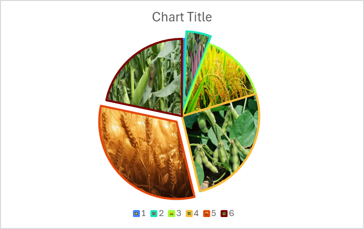
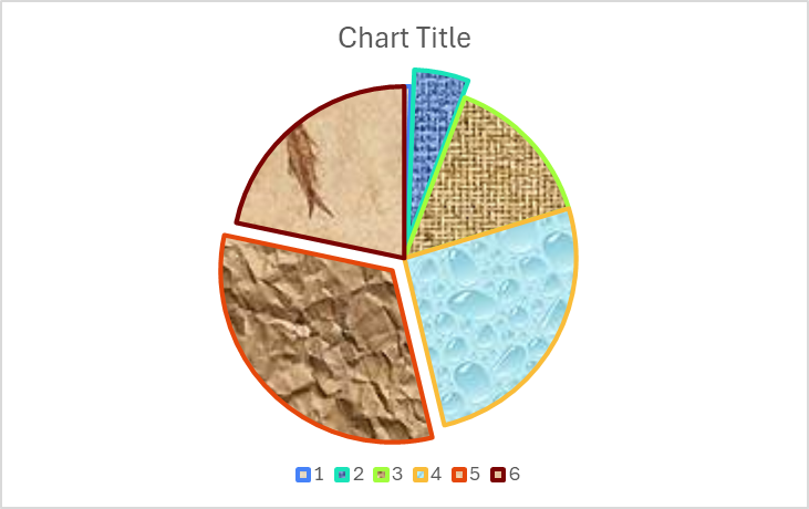
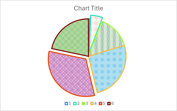
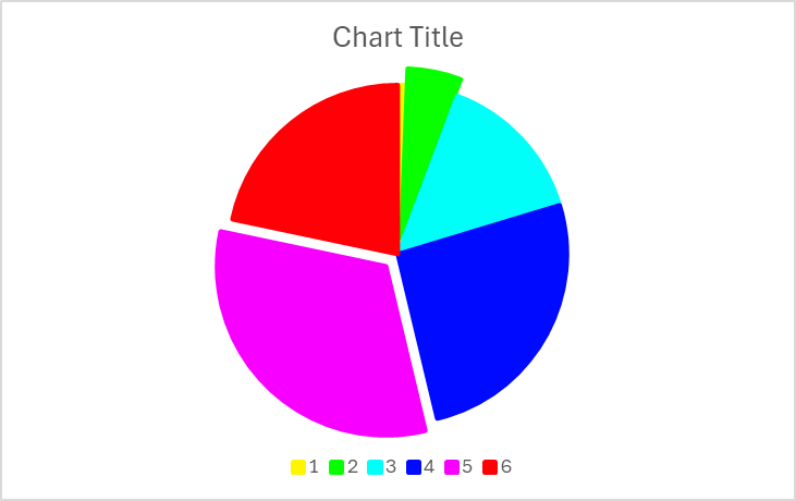
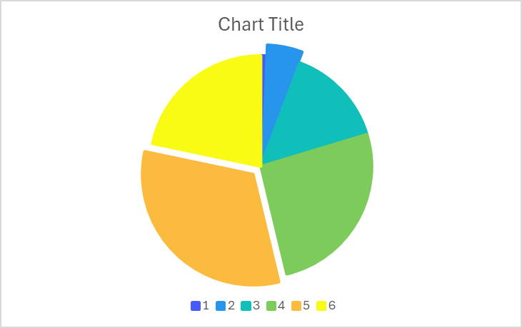
Flowing these steps to create 2d pie chart:

First, select data in the worksheet.
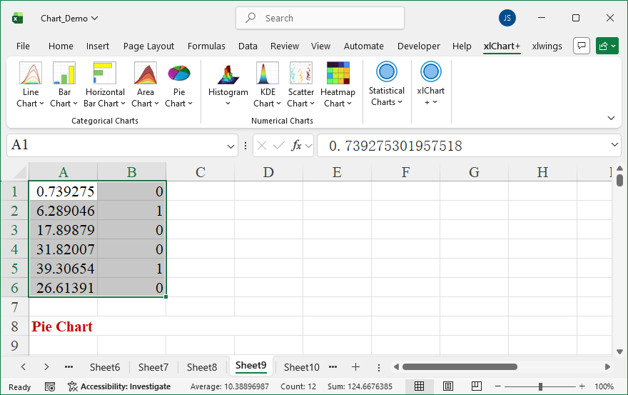
Click “2D” item in “Pie Chart” menu in xlChart+ add-in, open “Create a Pie Chart” dialog box.
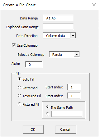
Click “OK” button.
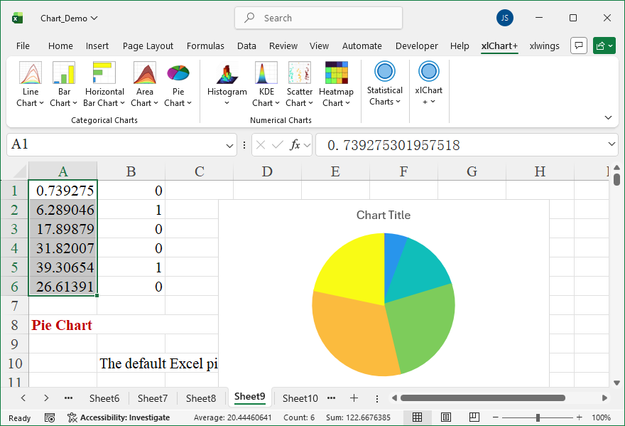
You can change the colormap by selecting another item in “Select a colormap” dropbox in “Create a Pie Chart” dialog box.
How To Create 3D Area Chart Using xlChart+ Add-in?
Flowing these steps to create 3d area chart:
First, select data in the worksheet.
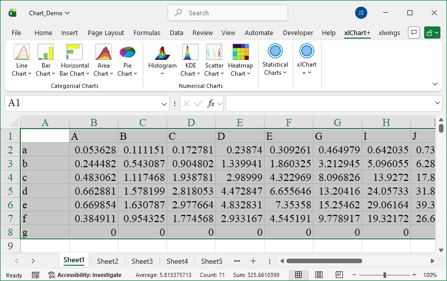
Click “3D” item in “Area Chart” menu in xlChart+ add-in, open “Create an 3D Area Chart” dialog box.
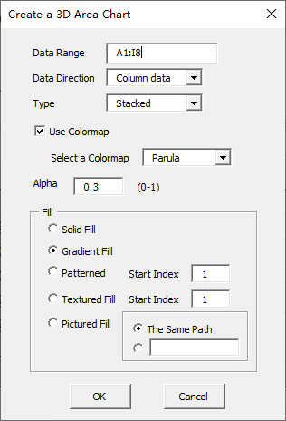
Click “OK” button.
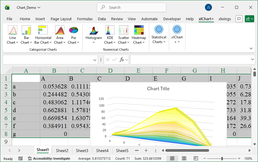
You can change the colormap by selecting another item in “Select a colormap” dropbox in “Create an 3D Area Chart” dialog box.
How To Create 2D 100% Percent Stacked Area Chart Using xlChart+ Add-in?
Flowing these steps to create 2d 100% percent stacked area chart:
First, select data in the worksheet.
Click “2D” item in “Area Chart” menu in xlChart+ add-in, open “Create an Area Chart” dialog box. Select “100% Stacked” item in “Type” dropbox.
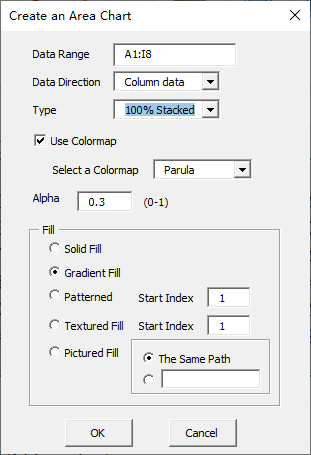
Click “OK” button.
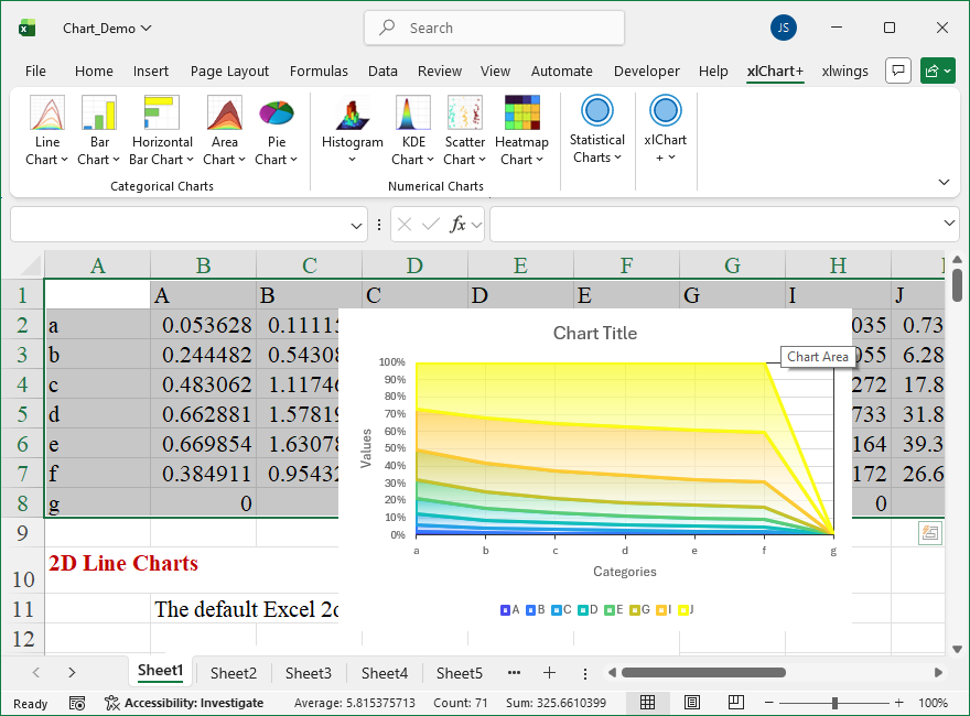
You can change the colormap by selecting another item in “Select a colormap” dropbox in “Create an Area Chart” dialog box.
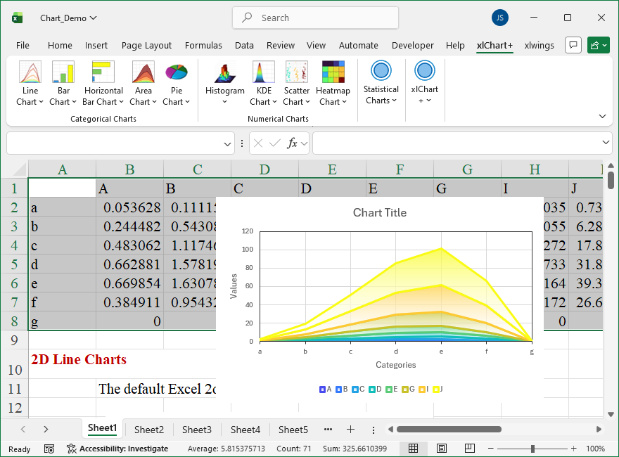
How To Create 2D Stacked Area Chart Using xlChart+ Add-in?
Flowing these steps to create 2d complex area chart: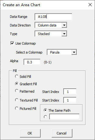
How To Create 2D Complex Area Chart Using xlChart+ Add-in?
Flowing these steps to create 2d complex area chart:
First, select data in the worksheet.
Click “2D” item in “Area Chart” menu in xlChart+ add-in, open “Create an Area Chart” dialog box. Select “Complex” item in “Type” dropbox.
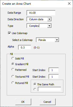
Click “OK” button.
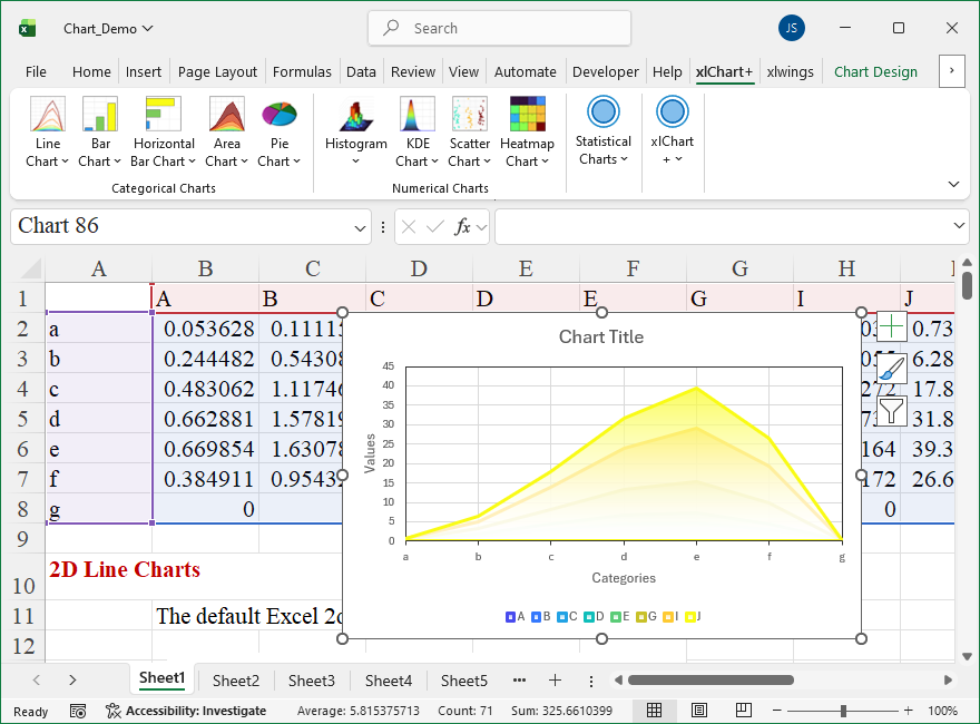
You can change the colormap by selecting another item in “Select a colormap” dropbox in “Create an Area Chart” dialog box.
How To Create 2D Area Chart Using xlChart+ Add-in?
Flowing these steps to create 2d area chart:
First, select data in the worksheet.
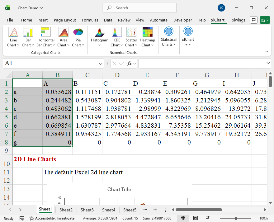
Click “2D” item in “Area Chart” menu in xlChart+ add-in, open “Create an Area Chart” dialog box.
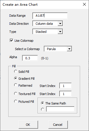
Click “OK” button.
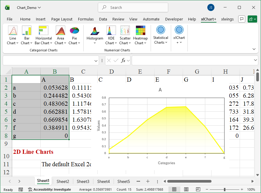
You can change the colormap by selecting another item in “Select a colormap” dropbox in “Create an Area Chart” dialog box.
How To Create 2D Texture Filled Bar Chart Using xlChart+ Add-in?
Flowing these steps to create 2d texture filled bar chart:
First, select data in the worksheet.
Click “2D Clustered” item in “Horizontal Bar Chart” menu in xlChart+ add-in, open “Create a Horizontal Bar Chart” dialog box, select “Textured Fill” option button in “Fill” frame.
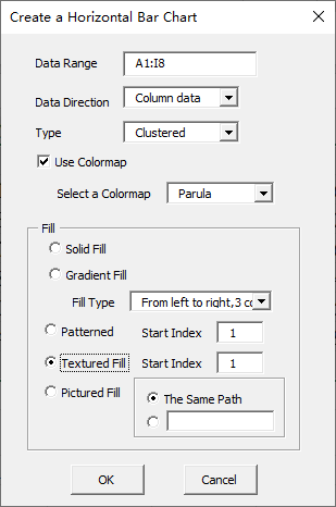
Click “OK” button.
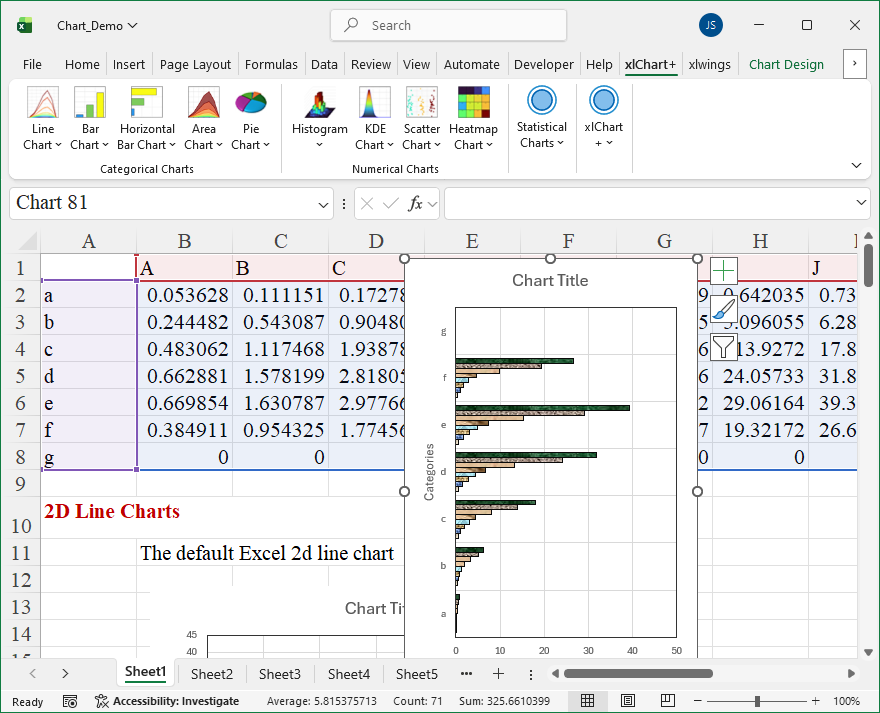
You can change the texture by inserting another value in “Start Index” textbox after “Textured Fill” option button in “Create a Horizontal Bar Chart” dialog box.
How To Set 3D Effects Using xlwings?
【Example】
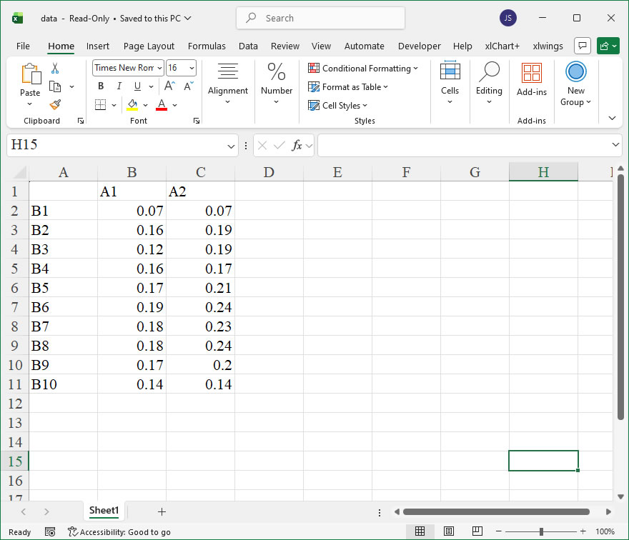
【Code】
import xlwings as xw
import os

def set_style(cht):
    cht.ChartArea.Format.Line.Visible=False
    cht.PlotArea.Format.Fill.Visible=False
    cht.PlotArea.Format.Line.Visible=True
    cht.PlotArea.Format.Line.ForeColor.RGB=xw.utils.rgb_to_int((200,200,200))
    #cht.PlotArea.Format.Line.ForeColor.ObjectThemeColor = msoThemeColorText1
    ax1=cht.Axes(1)
    ax2=cht.Axes(2)
    ax1.HasTitle=True
    ax1.AxisTitle.Text='Categories'
    ax1.AxisTitle.Font.Size=10
    ax1.TickLabels.Font.Size=8
    #ax1.TickLabels.NumberFormat='0.00'
    ax1.HasMajorGridlines=False
    ax2.HasTitle=True
    ax2.AxisTitle.Text='Values'
    ax2.AxisTitle.Font.Size=10
    ax2.TickLabels.Font.Size=8
    ax2.HasMajorGridlines=False
    cht.HasTitle=True
    #cht.ChartTitle.Caption='Plot'
    #cht.ChartTitle.Font.Size=12

root=os.getcwd()
app=xw.App(visible=True,add_book=False)
wb=app.books.open(root+r'/data.xlsx',read_only=False)
sht=wb.sheets('Sheet1')

sht.api.Range('A2:B7').Select()  #数据
shp=sht.api.Shapes.AddChart2(-1,xw.constants.ChartType.xlColumnClustered,20,20,350,250,True)
cht=shp.Chart  #添加图表
threed=cht.SeriesCollection(1).Format.ThreeD
threed.BevelTopType=3    #msoBevelAngle
threed.BevelTopInset=36
threed.BevelTopDepth=6
threed.PresetMaterial=2    #msoMaterialMetal2
threed.LightAngle=60
threed.PresetLighting=1    #msoLightRigMorning

set_style(cht)

cht.Export(root+'/cht.jpg')
cht.Export(root+'/cht.svg')
cht.ExportAsFixedFormat(0,root+'/cht.pdf')

#wb.save()
#app.kill()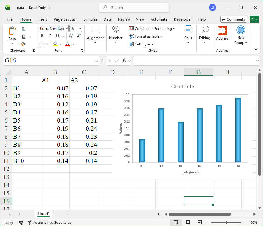
How to use Application.AddCustomList in the xlwings API way
The AddCustomList member of the Application object in Excel is a method that allows you to define a custom list for sorting and auto-filling data. Custom lists are particularly useful for creating personalized sorting orders, such as days of the week, months, or any user-defined sequence, which can then be applied across worksheets to ensure consistent data organization. In xlwings, this functionality is accessed through the api property, which provides direct access to the underlying Excel object model, enabling precise control over Excel’s features from Python.
Functionality:
The primary function of AddCustomList is to add a new custom list to Excel’s memory. Once added, this list can be used in sorting operations or for auto-fill actions, where dragging a cell’s fill handle will populate cells based on the defined sequence. This is beneficial for standardizing data entry and maintaining order in datasets that follow non-alphabetical or non-numeric sequences.
Syntax in xlwings:
The xlwings API call follows the pattern:
app.api.AddCustomList(ListArray, ByRow)- ListArray: This parameter specifies the items to be included in the custom list. It can be provided as a Python list or tuple containing strings or numbers. For example,
['Low', 'Medium', 'High']or('Q1', 'Q2', 'Q3', 'Q4'). The list must be one-dimensional. - ByRow: This is a Boolean parameter that indicates whether the list is arranged by rows. In most cases, setting
ByRowtoFalseis appropriate, as custom lists are typically column-oriented. If set toTrue, the list is interpreted as a row-based array, but this is less common. The default behavior in Excel VBA isFalse, and it is generally recommended to useFalsein xlwings unless specific row-based data is provided.
Example Usage:
Below is an xlwings code example that demonstrates how to add a custom list and then use it for sorting data in an Excel worksheet. This example assumes an existing Excel workbook is open via xlwings.
import xlwings as xw

# Connect to the active Excel application
app = xw.apps.active

# Define a custom list for priority levels
custom_list = ['Low', 'Medium', 'High']

# Add the custom list using the Application object's AddCustomList method
app.api.AddCustomList(ListArray=custom_list, ByRow=False)

# Now, use the custom list to sort data in a specific worksheet
wb = xw.books.active
ws = wb.sheets['Sheet1']

# Assume column A contains priority data to be sorted based on the custom list
# Set the sort range (e.g., A1:A10)
sort_range = ws.range('A1:A10')

# Apply sorting with the custom order
sort_range.api.Sort(
Key1=ws.range('A1').api,
Order1=1, # Ascending order
CustomOrder=custom_list[0], # Use the first item of the list to reference the custom list
DataOption1=0
)

# Note: In Excel, the custom list is stored globally, so it can be reused across workbooks during the session.How To Set Edge Softening Using xlwings?
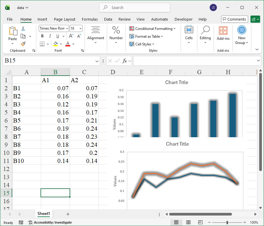
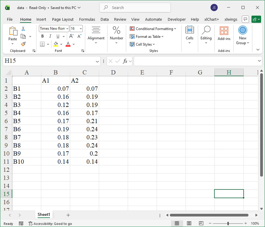
【Example】
【Code】
import xlwings as xw
import os

def set_style(cht):
    cht.ChartArea.Format.Line.Visible=False
    cht.PlotArea.Format.Fill.Visible=False
    cht.PlotArea.Format.Line.Visible=True
    cht.PlotArea.Format.Line.ForeColor.RGB=xw.utils.rgb_to_int((200,200,200))
    #cht.PlotArea.Format.Line.ForeColor.ObjectThemeColor = msoThemeColorText1
    ax1=cht.Axes(1)
    ax2=cht.Axes(2)
    ax1.HasTitle=True
    ax1.AxisTitle.Text='Categories'
    ax1.AxisTitle.Font.Size=10
    ax1.TickLabels.Font.Size=8
    #ax1.TickLabels.NumberFormat='0.00'
    ax1.HasMajorGridlines=False
    ax2.HasTitle=True
    ax2.AxisTitle.Text='Values'
    ax2.AxisTitle.Font.Size=10
    ax2.TickLabels.Font.Size=8
    ax2.HasMajorGridlines=False
    cht.HasTitle=True
    #cht.ChartTitle.Caption='Plot'
    #cht.ChartTitle.Font.Size=12

root=os.getcwd()
app=xw.App(visible=True,add_book=False)
wb=app.books.open(root+r'/data.xlsx',read_only=False)
sht=wb.sheets('Sheet1')

sht.api.Range('A2:B7').Select()  #数据
shp=sht.api.Shapes.AddChart2(-1,xw.constants.ChartType.xlColumnClustered,20,20,350,250,True)
cht=shp.Chart  #添加图表
glow=cht.SeriesCollection(1).Format.Glow
glow.Color.ObjectThemeColor=1    #msoThemeColorAccent1
#glow.Color.TintAndShade=0
glow.Color.Brightness=0
glow.Transparency=0.6000000238
glow.Radius=8

sht.api.Range('A2:C11').Select()  #数据
shp2=sht.api.Shapes.AddChart2(-1,xw.constants.ChartType.xlLine,30,20,350,250,True)
cht2=shp2.Chart  #添加图表
glow2=cht2.SeriesCollection(1).Format.Glow
glow2.Color.ObjectThemeColor=1    #msoThemeColorAccent1
#glow2.Color.TintAndShade=0
glow2.Color.Brightness=0
glow2.Transparency=0.6000000238
glow2.Radius=5
glow3=cht2.SeriesCollection(2).Format.Glow
glow3.Color.ObjectThemeColor=1    #msoThemeColorAccent1
#glow3.Color.TintAndShade=0
glow3.Color.Brightness=0
glow3.Transparency=0.6000000238
glow3.Radius=8

set_style(cht)
set_style(cht2)

cht.Export(root+'/cht.jpg')
cht.Export(root+'/cht.svg')
cht.ExportAsFixedFormat(0,root+'/cht.pdf')
cht2.Export(root+'/cht2.jpg')
cht.Export(root+'/cht2.svg')
cht2.ExportAsFixedFormat(0,root+'/cht2.pdf')

#wb.save()
#app.kill()