Blog
How To Create 2D Pattern Filled Column Chart Using xlChart+ Add-in?
Flowing these steps to create 2d pattern filled column chart:

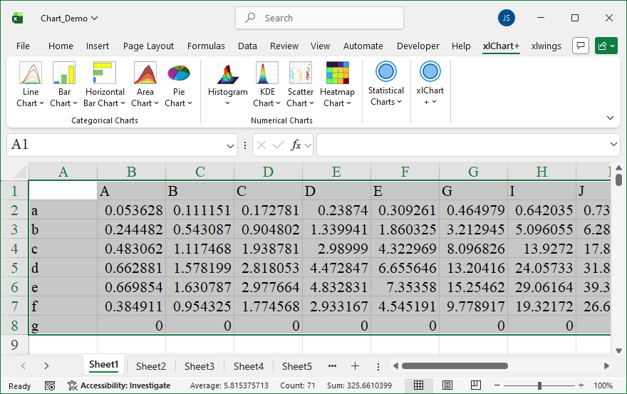
First, select data in the worksheet.
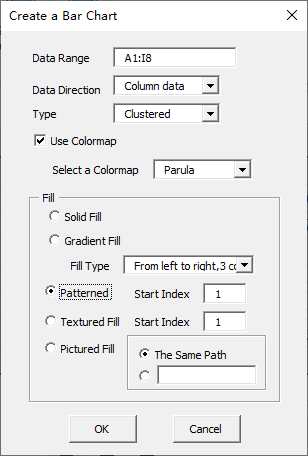
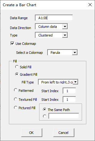
Click “2D Clustered” item in “Bar Chart” menu in xlChart+ add-in, open “Create a Bar Chart” dialog box, select “Patterned” option button in “Fill” frame.
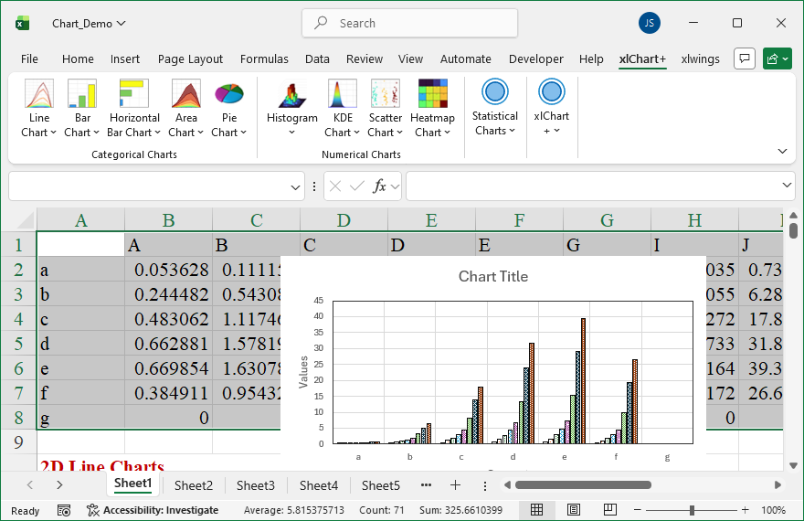
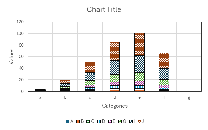
Click “OK” button.
You can change the pattern by inserting another value in “Start Index” textbox after “Patterened” option button in “Create a Bar Chart” dialog box.
How To Create 2D Gradient Filled Column Chart Using xlChart+ Add-in?
Flowing these steps to create 2d gradient filled column chart:
First, select data in the worksheet.
Click “2D Clustered” item in “Bar Chart” menu in xlChart+ add-in, open “Create a Bar Chart” dialog box.

Click “OK” button.

You can change the gradient fill type by selecting another item in “Fill Type” dropbox in “Create a Bar Chart” dialog box.

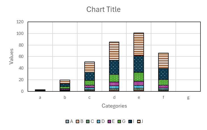
How To Create 2D 100% Percent Stacked Column Chart Using xlChart+ Add-in?
Flowing these steps to create 2d 100% percent stacked column chart:
First, select data in the worksheet.
Click “2D 100% Clustered” item in “Bar Chart” menu in xlChart+ add-in, open “Create a Bar Chart” dialog box.

Click “OK” button.
You can change the colormap by selecting another item in “Select a colormap” dropbox in “Create a Bar Chart” dialog box.
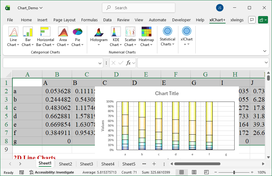
How To Create 2D Stacked Column Chart Using xlChart+ Add-in?
Flowing these steps to create 2d stacked column chart:
First, select data in the worksheet.
Click “2D Stacked” item in “Bar Chart” menu in xlChart+ add-in, open “Create a Bar Chart” dialog box.

Click “OK” button.

You can change the colormap by selecting another item in “Select a colormap” dropbox in “Create a Bar Chart” dialog box.


How To Create 2D Complex Column Chart Using xlChart+ Add-in?
Flowing these steps to create 2d complex column chart:
First, select data in the worksheet.
Click “2D Clustered” item in “Bar Chart” menu in xlChart+ add-in, open “Create a Bar Chart” dialog box.
Click “OK” button.

You can change the colormap by selecting another item in “Select a colormap” dropbox in “Create a Bar Chart” dialog box.


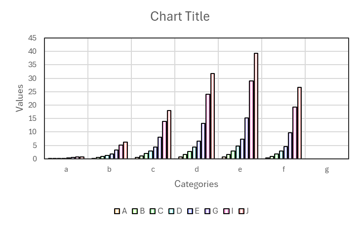
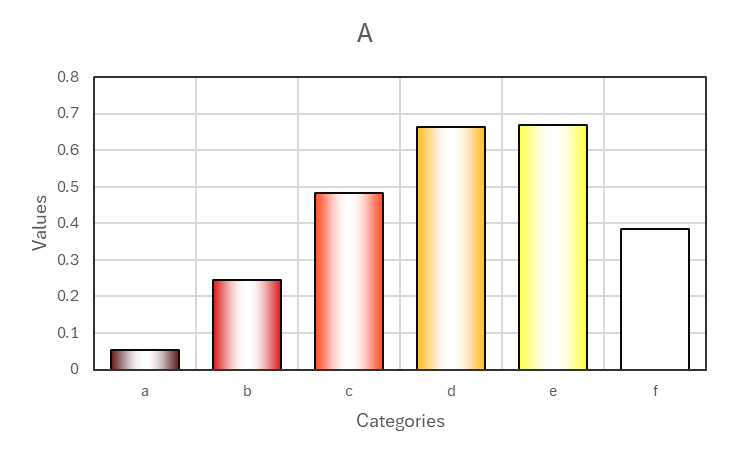
How To Create 2D Column Chart Using xlChart+ Add-in?
Flowing these steps to create 2d column chart:
First, select data in the worksheet.
Click “2D Clustered” item in “Bar Chart” menu in xlChart+ add-in, open “Create a Bar Chart” dialog box.

Click “OK” button.

You can change the colormap by selecting another item in “Select a colormap” dropbox in “Create a Bar Chart” dialog box.


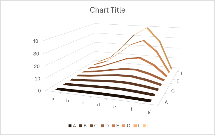
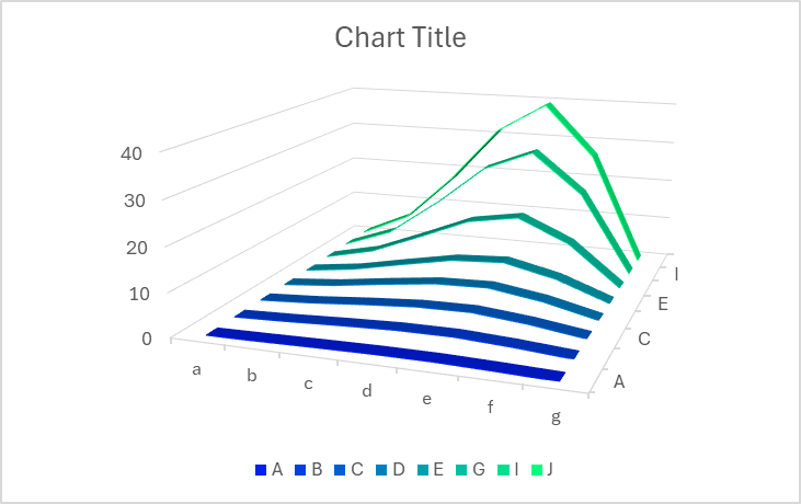
How To Create 3D Line Chart Using xlChart+ Add-in?
Flowing these steps to create 3d line chart:
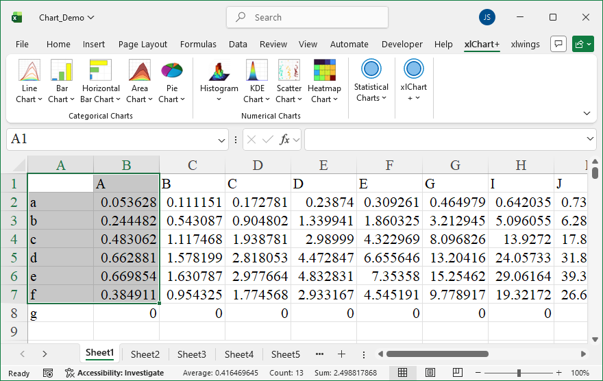
Select data in the worksheet:

Click “3D” item in “Line Chart” menu in xlChart+ add-in, open “Create a 3D Line Chart” dialog box.

Click “OK” button.

You can change the colormap by selecting another item in “Select a colormap” dropbox in “Create a 3D Line Chart” dialog box.

How To Create Smoothed Curve Using xlChart+ Add-in?
Flowing these steps to create smoothed curve chart:
Select data in the worksheet:
Click “Smoothed Curve” item in “Line Chart” menu in xlChart+ add-in, open “Create a Smoothed Line Chart” dialog box.

Click “OK” button.

You can change the colormap by selecting another item in “Select a colormap” dropbox in “Create a Line Chart” dialog box.
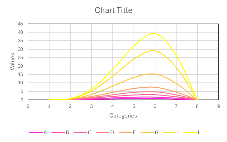


How To Create 2D Complex Line Chart Using xlChart+ Add-in?
Flowing these steps to create 2d complex line chart:
Select data in the worksheet:
Click “2D Line Chart” item in “Line Chart” menu in xlChart+ add-in, open “Create a Line Chart” dialog box.

Click “OK” button.

You can change the colormap by selecting another item in “Select a colormap” dropbox in “Create a Line Chart” dialog box.


How To Create 2D Line Chart Using xlChart+ Add-in?
Flowing these steps to create dot chart:
First, select data in the worksheet.

Click “2D Line Chart” item in “Line Chart” menu in xlChart+ add-in, open “Create a Line Chart” dialog box.

Click “OK” button.
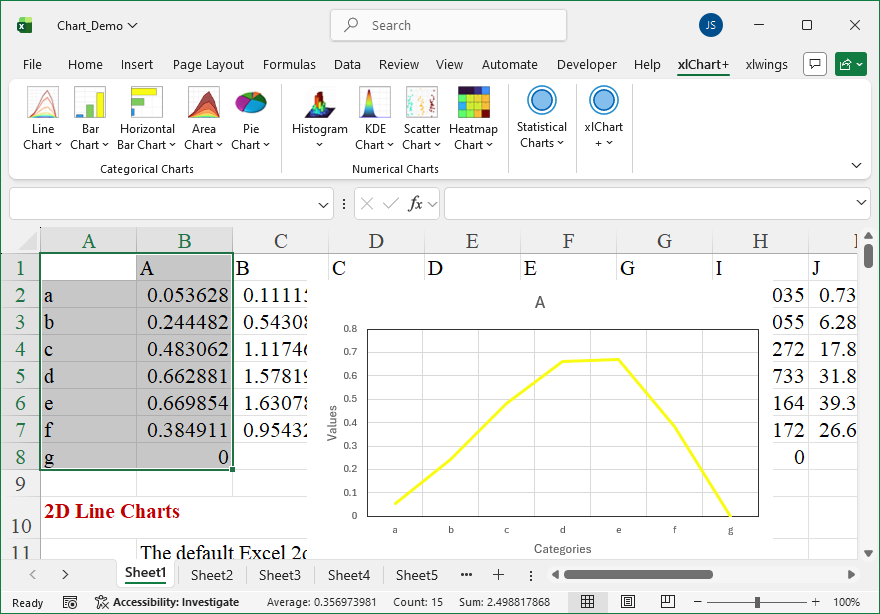
You can change the colormap by selecting another item in “Select a colormap” dropbox in “Create a Line Chart” dialog box.