Method
Use the `AddChart2` method of the `Shapes` object to create a chart. The syntax is:
sht.api.Shapes.AddChart2(Style, XlChartType, Left, Top, Width, Height, NewLayout)
Where `sht` is the current worksheet. There are 7 parameters, all optional.
- Style:Chart style, -1 represents the default style for the chart type
- xlChartType:Chart type, using values from the `XlChartType` enumeration, a part of which is listed below
- Left:Left position of the chart, centered horizontally if omitted
- Top:Top position of the chart, centered vertically if omitted
- Width:Width of the chart, default is 354 if omitted
- Height:Height of the chart, default is 210 if omitted
- NewLayout:Determines the chart layout. If `True`, legends are shown only for composite charts
|
Name |
Value |
Description |
|
xlArea |
1 |
Area chart |
|
xlLine |
4 |
Line chart |
|
xlPie |
5 |
Pie chart |
|
xlBarClustered |
57 |
Clustered bar chart |
|
xlBarStacked |
58 |
Stacked bar chart |
|
xlXYScatter |
-4169 |
XY scatter chart |
|
xlBubble |
个 |
Bubble chart |
|
xlSurface |
83 |
3D Surface chart |
|
…… |
sht.api.Range(‘A1’).CurrentRegion.Select()
sht.api.Shapes.AddChart2(-1,xw.constants.ChartType.xlColumnClustered,30,150,300,200,True)
Sample Code
#Drawing charts

import xlwings as xw
import os

root = os.getcwd()
app = xw.App(visible=True, add_book=False)
wb=app.books.open(root+r'/GDP.xlsx',read_only=False)
sht=wb.sheets(1)

sht.api.Range('B1:H7').Select()
sht.api.Shapes.AddChart2(-1,xw.constants.ChartType.xlColumnClustered,30,150,300,200,True)

#bk.save()
#bk.close()
#app.kill()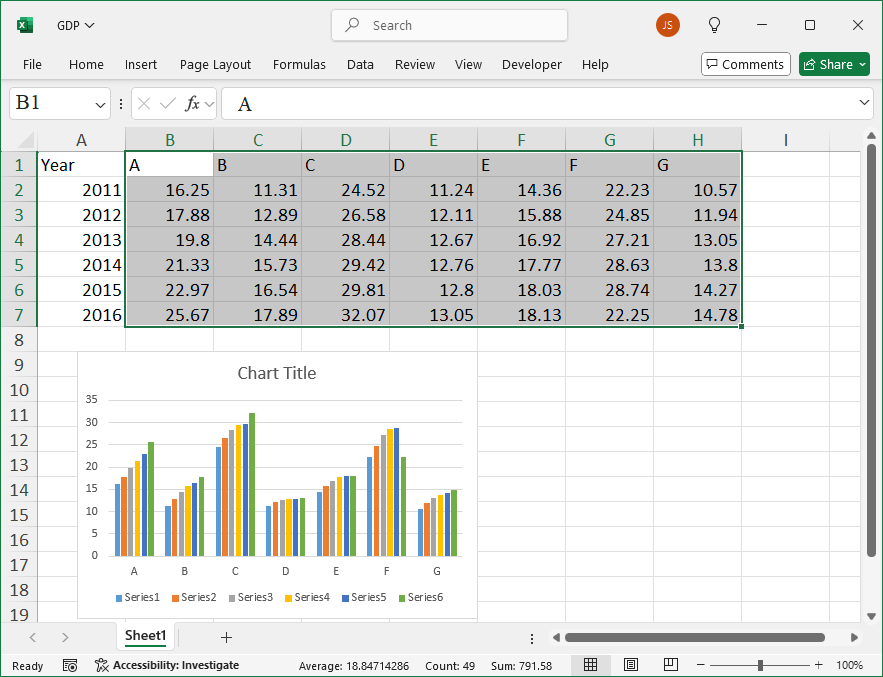
Leave a Reply