Archive

How To Create 2D Complex Column Chart Using xlChart+ Add-in?

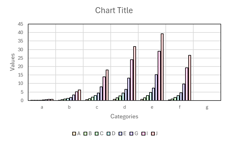
Flowing these steps to create 2d complex column chart:

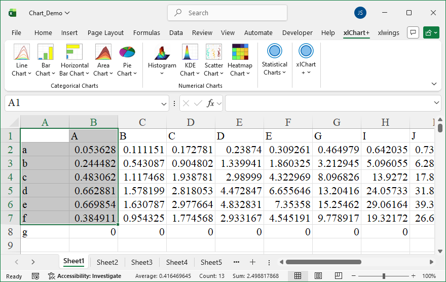
First, select data in the worksheet.

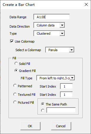
Click “2D Clustered” item in “Bar Chart” menu in xlChart+ add-in, open “Create a Bar Chart” dialog box.

Click “OK” button.

You can change the colormap by selecting another item in “Select a colormap” dropbox in “Create a Bar Chart” dialog box.

How To Create 2D Column Chart Using xlChart+ Add-in?

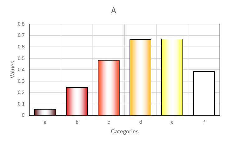
Flowing these steps to create 2d column chart:

First, select data in the worksheet.

Click “2D Clustered” item in “Bar Chart” menu in xlChart+ add-in, open “Create a Bar Chart” dialog box.

Click “OK” button.

You can change the colormap by selecting another item in “Select a colormap” dropbox in “Create a Bar Chart” dialog box.

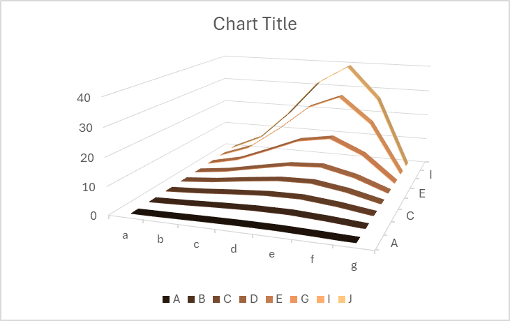
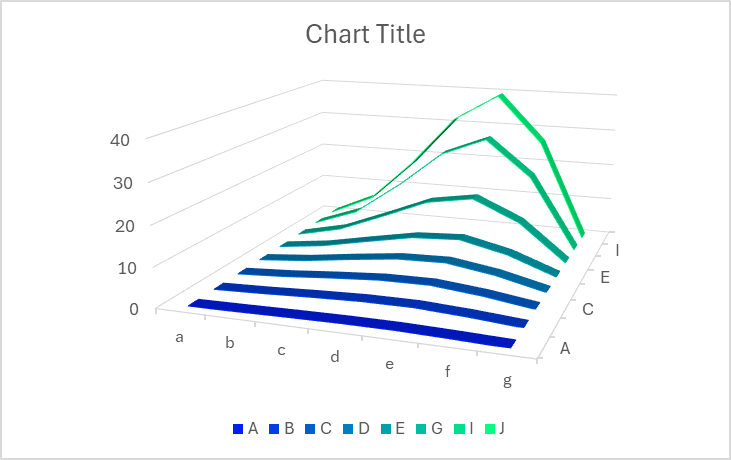
How To Create 3D Line Chart Using xlChart+ Add-in?

Flowing these steps to create 3d line chart:

Select data in the worksheet:

Click “3D” item in “Line Chart” menu in xlChart+ add-in, open “Create a 3D Line Chart” dialog box.

Click “OK” button.

You can change the colormap by selecting another item in “Select a colormap” dropbox in “Create a 3D Line Chart” dialog box.

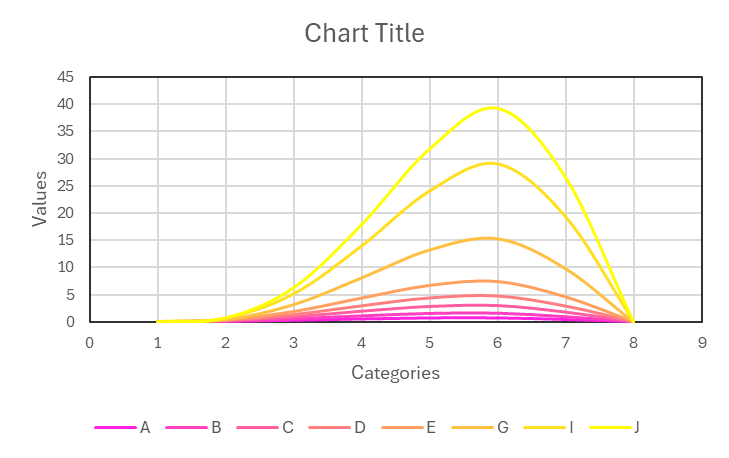
How To Create Smoothed Curve Using xlChart+ Add-in?

Flowing these steps to create smoothed curve chart:

Select data in the worksheet:

Click “Smoothed Curve” item in “Line Chart” menu in xlChart+ add-in, open “Create a Smoothed Line Chart” dialog box.

Click “OK” button.

You can change the colormap by selecting another item in “Select a colormap” dropbox in “Create a Line Chart” dialog box.

How To Create 2D Complex Line Chart Using xlChart+ Add-in?

Flowing these steps to create 2d complex line chart:

Select data in the worksheet:

Click “2D Line Chart” item in “Line Chart” menu in xlChart+ add-in, open “Create a Line Chart” dialog box.

Click “OK” button.

You can change the colormap by selecting another item in “Select a colormap” dropbox in “Create a Line Chart” dialog box.

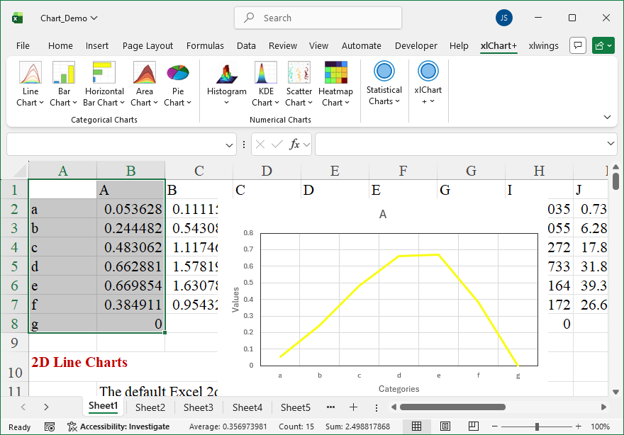
How To Create 2D Line Chart Using xlChart+ Add-in?

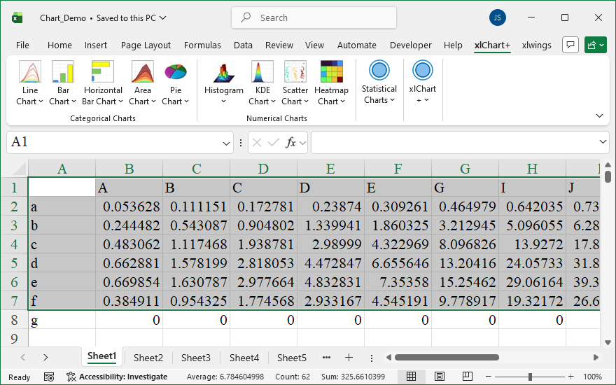
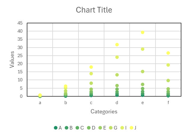
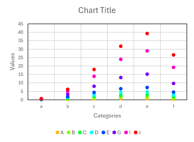
Flowing these steps to create dot chart:

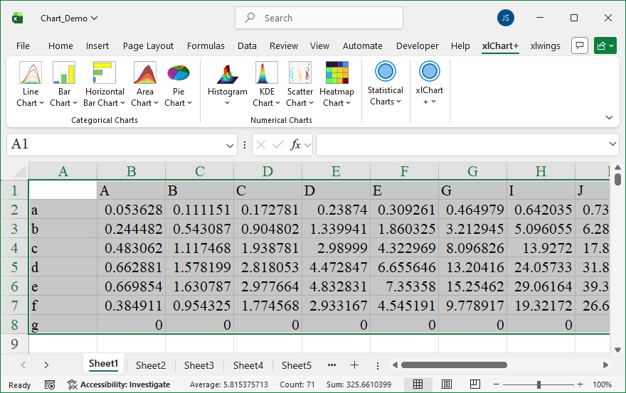
First, select data in the worksheet.

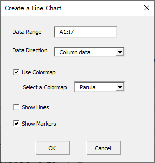
Click “2D Line Chart” item in “Line Chart” menu in xlChart+ add-in, open “Create a Line Chart” dialog box.

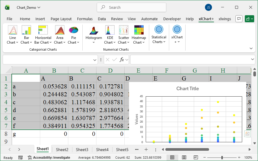
Click “OK” button.

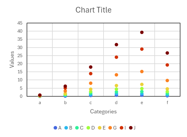
You can change the colormap by selecting another item in “Select a colormap” dropbox in “Create a Line Chart” dialog box.

How To Create Dot Chart Using xlChart+ Add-in?

Flowing these steps to create dot chart:

First, select data in the worksheet.

Click “2D Line Chart” item in “Line Chart” menu in xlChart+ add-in, open “Create a Line Chart” dialog box.

Click “OK” button.

You can change the colormap by selecting another item in “Select a colormap” dropbox in “Create a Line Chart” dialog box.

What Is xlChart+ Add-in?

xlChart+ add-in helps you create common charts faster with one-click color schemes. Create histograms, KDE plots, jitter scatter plots, heatmaps, violin plots, raincloud plots, and other charts that Excel doesn’t have.

Main Features

One-Click Color Schemes

Apply professional color palettes to your charts instantly

Beautiful Pre-designed Palettes

Choose from dozens of carefully crafted color schemes designed by professionals. Each palette is optimized for clarity, accessibility, and visual appeal. Transform your charts from basic to stunning with a single click.

  • 20+ professional color palettes
  • Colorblind-friendly options
  • Custom palette creator
Various chart types with different color schemes

2D & 3D Histograms

Visualize data distributions with advanced histogram charts

2D and 3D histogram visualizations

Advanced Distribution Analysis

Create sophisticated 2D and 3D histograms that Excel can’t produce natively. Perfect for statistical analysis, data exploration, and presenting frequency distributions with professional polish.

  • Customizable bin sizes
  • 3D visualization support
  • Overlay multiple distributions

2D & 3D KDE Plots

Kernel Density Estimation for smooth probability distributions

Smooth Density Visualization

Generate beautiful Kernel Density Estimation plots that show the probability density function of your data. Perfect for understanding data distribution patterns and identifying peaks, valleys, and outliers.

  • Multiple kernel functions
  • Adjustable bandwidth
  • 3D surface plots
KDE plots including 2D and 3D surface visualizations

Jitter Scatter Plots & Regular Scatter Plots

Reveal patterns in your data with advanced scatter plot techniques

Jitter scatter plots and regular scatter plots

Enhanced Scatter Visualization

Create jitter scatter plots that prevent overlapping points, making it easier to see data density. Perfect for categorical data and revealing patterns that traditional scatter plots might hide.

  • Automatic jitter adjustment
  • Size and color mapping
  • Trend line overlays

Heatmaps

Visualize complex data matrices with intuitive color gradients

Matrix Data Visualization

Transform complex data matrices into intuitive heatmaps. Perfect for correlation analysis, time-series data, and identifying patterns across multiple variables at a glance.

  • Hierarchical clustering
  • Custom color scales
  • Annotation support
Heatmaps with various color schemes

Violin Plots & Raincloud Plots

Advanced statistical visualization for distribution comparison

Violin plots, boxplots, and raincloud plots

Rich Distribution Insights

Combine the best of box plots, density plots, and scatter plots. Violin plots show the full distribution shape, while raincloud plots add individual data points for complete transparency.

  • Show full data distribution
  • Compare multiple groups
  • Statistical annotations