Blog
How To Create Bivariate Histogram Chart Using xlChart+ Add-in?
Flowing these steps to create bivariate histogram chart:

First, select data in the worksheet.
Click “Bivariate” item in “Histogram” menu in xlChart+ add-in, open “Create a Bivariate Histogram Chart” dialog box. Input B2:B1001 in “Data Range of Y” textbox.
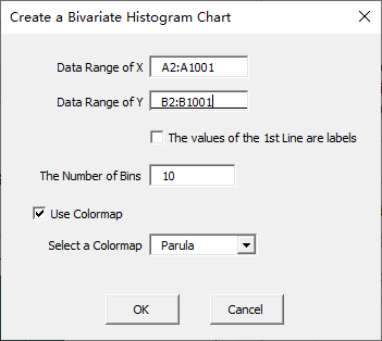
Click “OK” button.
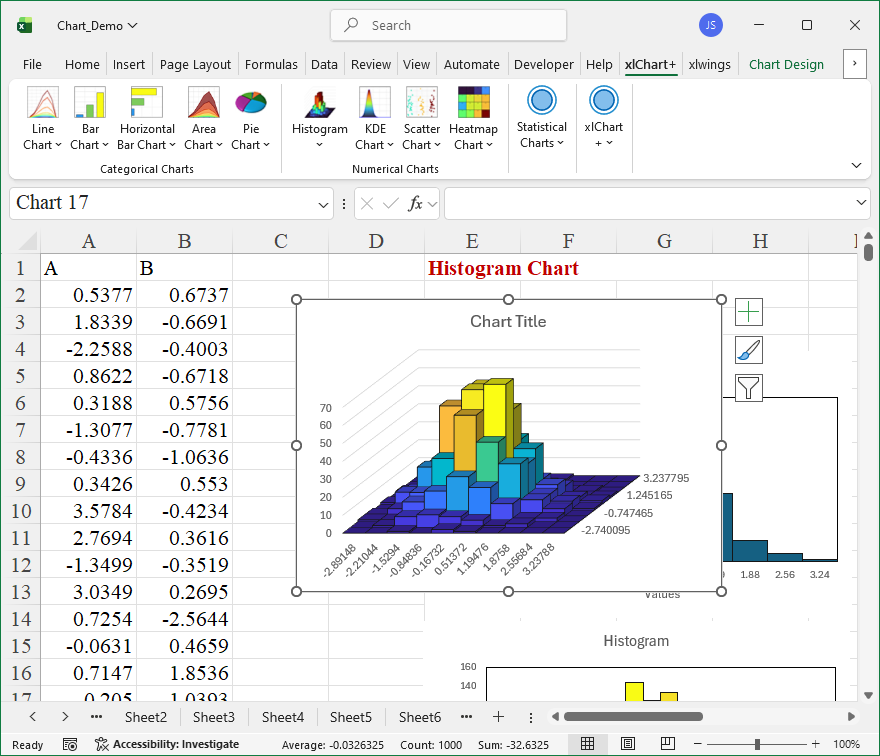
You can change the colormap by selecting another item in “Select a colormap” dropbox in “Create a Bivariate Doughnut Chart” dialog box.
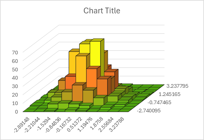
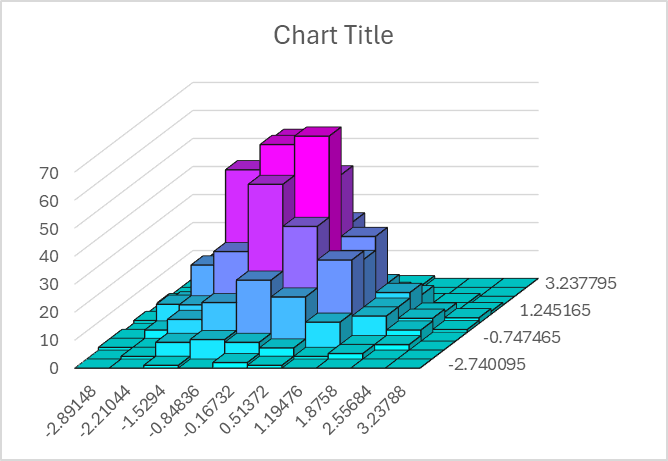
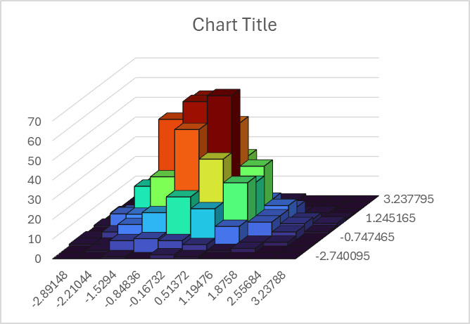
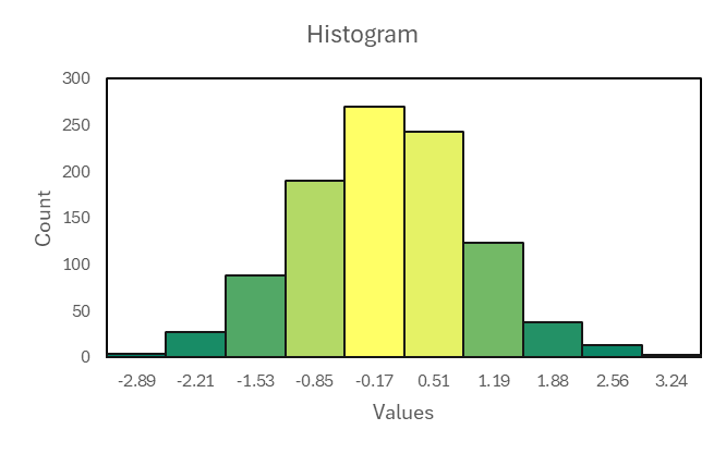
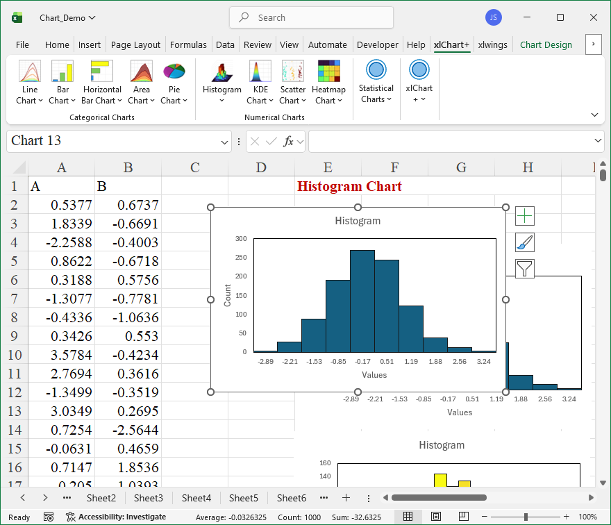
How To Create Colormap Univariate Histogram Chart Using xlChart+ Add-in?
Flowing these steps to create histogram chart:
First, select data in the worksheet.
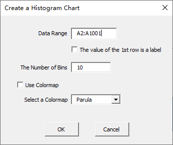
Click “Univariate-Colormap” item in “Histogram” menu in xlChart+ add-in, open “Create a Histogram Chart” dialog box.
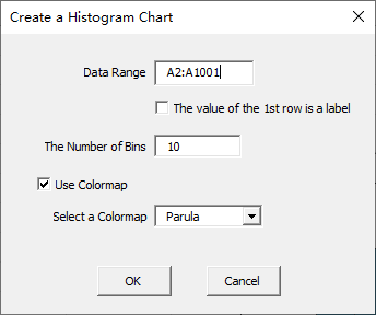
Click “OK” button.
You can change the colormap by selecting another item in “Select a colormap” dropbox in “Create a Histogram Chart” dialog box.
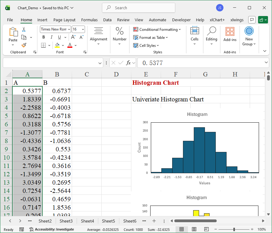
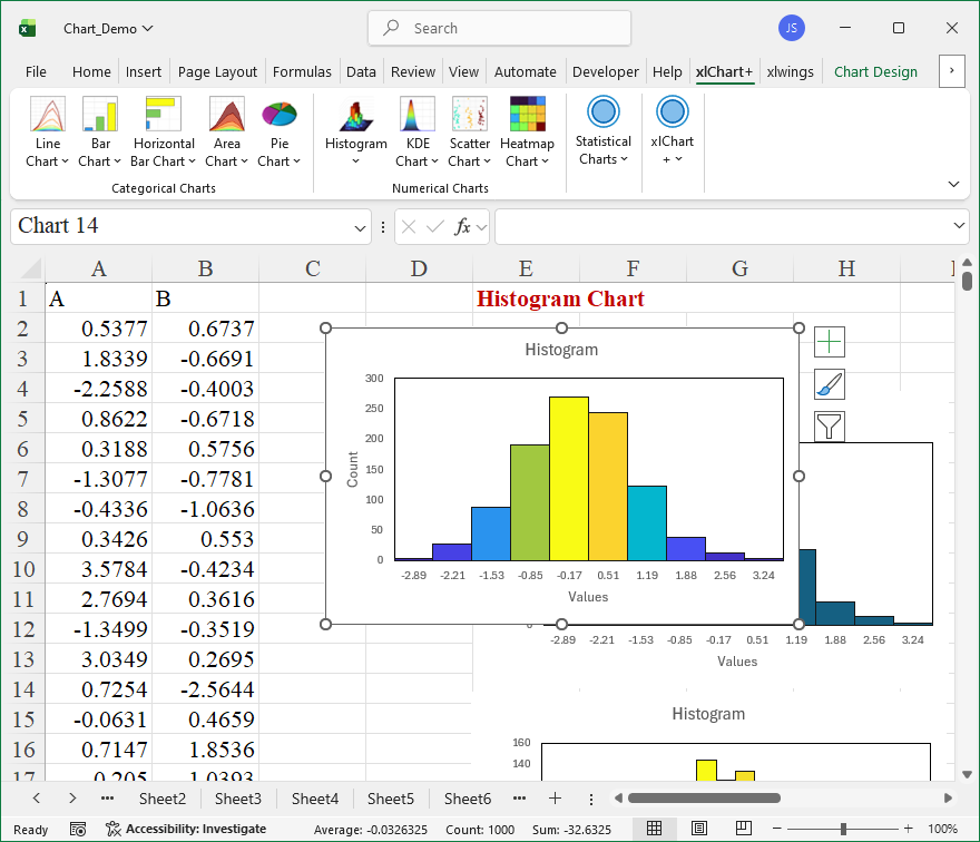
How To Create Single Color Univariate Histogram Chart Using xlChart+ Add-in?
Flowing these steps to create histogram chart:
First, select data in the worksheet.
Click “Univariate-Single Color” item in “Histogram” menu in xlChart+ add-in, open “Create a Histogram Chart” dialog box.
Click “OK” button.
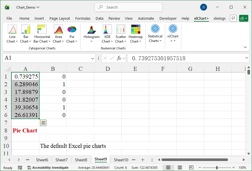
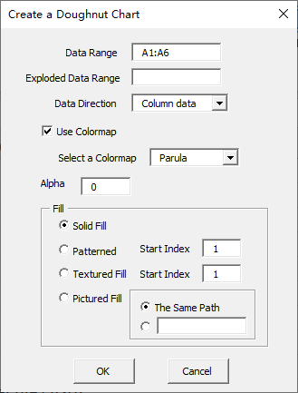
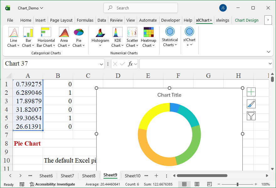
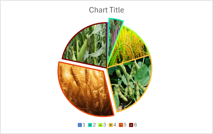
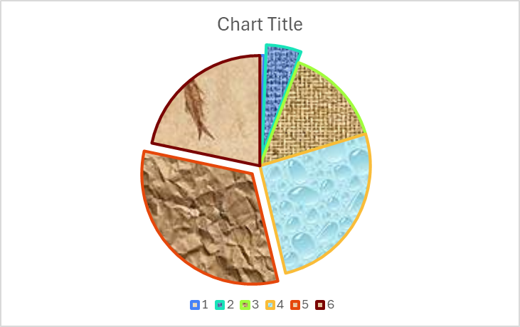
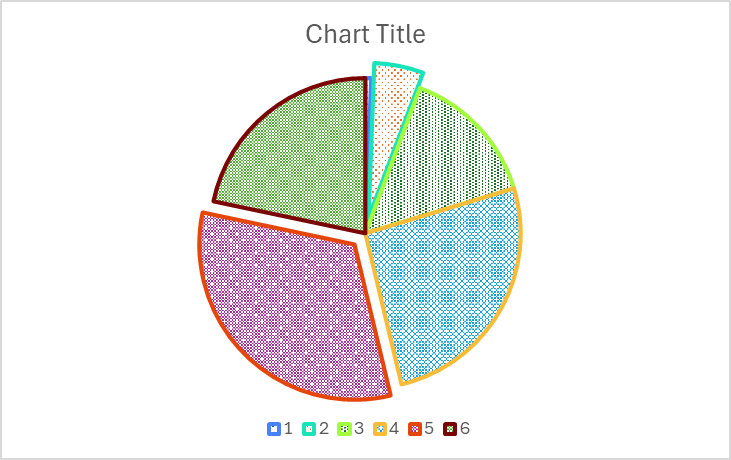
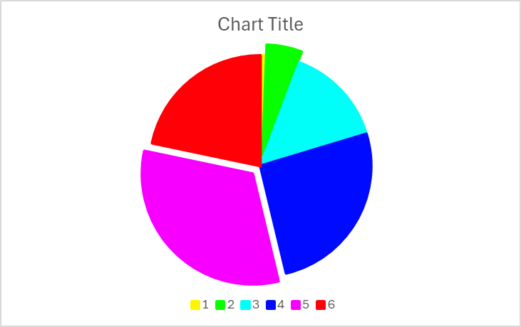
How To Create Doughnut Chart Using xlChart+ Add-in?
Flowing these steps to create doughnut chart:
First, select data in the worksheet.
Click “Doughnut” item in “Pie Chart” menu in xlChart+ add-in, open “Create a Doughnut Chart” dialog box.
Click “OK” button.
You can change the colormap by selecting another item in “Select a colormap” dropbox in “Create a Doughnut Chart” dialog box.
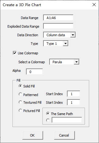
How To Create Type 3 3D Pie Chart Using xlChart+ Add-in?
Flowing these steps to create 3d pie chart:
First, select data in the worksheet.
Click “3D-Type1” item in “Pie Chart” menu in xlChart+ add-in, open “Create a 3D Pie Chart” dialog box.

Click “OK” button.
You can change the colormap by selecting another item in “Select a colormap” dropbox in “Create a Pie Chart” dialog box.
How To Create Type 2 3D Pie Chart Using xlChart+ Add-in?
Flowing these steps to create 3d pie chart:
First, select data in the worksheet.
Click “3D-Type2” item in “Pie Chart” menu in xlChart+ add-in, open “Create a 3D Pie Chart” dialog box.

Click “OK” button.
You can change the colormap by selecting another item in “Select a colormap” dropbox in “Create a Pie Chart” dialog box.
How To Create Type 1 3D Pie Chart Using xlChart+ Add-in?
Flowing these steps to create 3d pie chart:
First, select data in the worksheet.
Click “3D-Type1” item in “Pie Chart” menu in xlChart+ add-in, open “Create a 3D Pie Chart” dialog box.
Click “OK” button.
You can change the colormap by selecting another item in “Select a colormap” dropbox in “Create a 3D Pie Chart” dialog box.
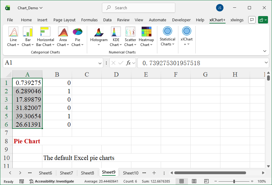
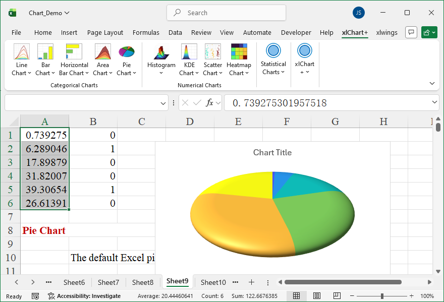
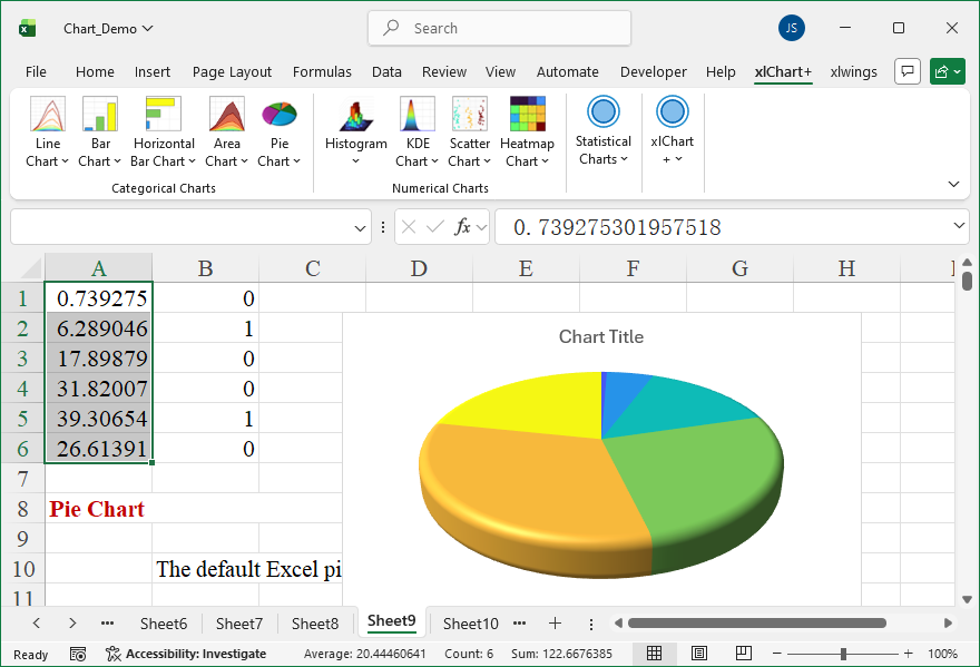
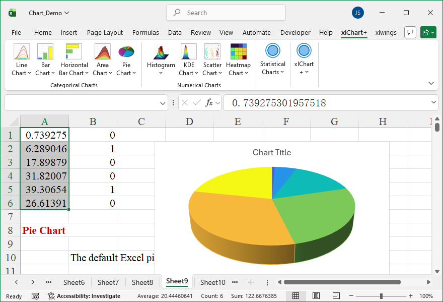
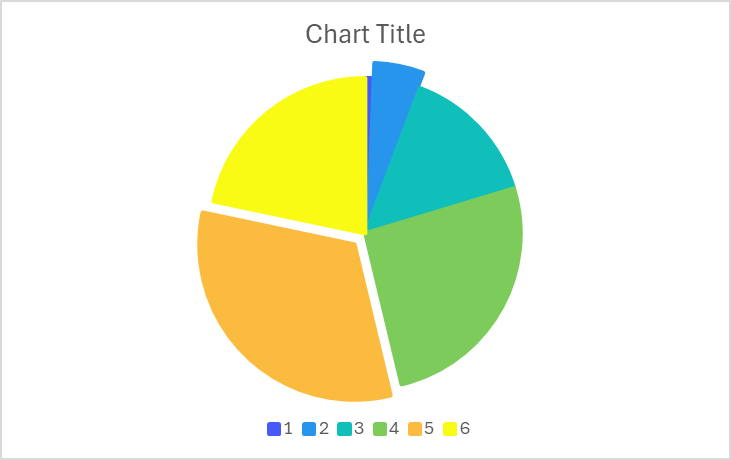
How To Create 2D Pie Chart Using xlChart+ Add-in?
Flowing these steps to create 2d pie chart:
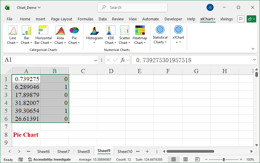
First, select data in the worksheet.
Click “2D” item in “Pie Chart” menu in xlChart+ add-in, open “Create a Pie Chart” dialog box.
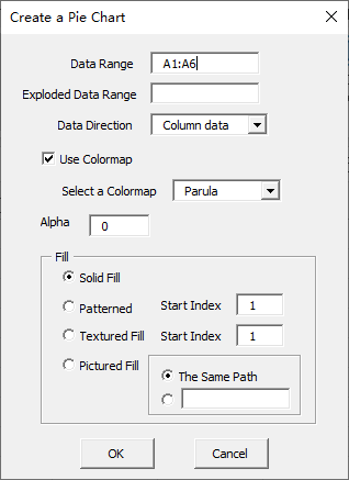
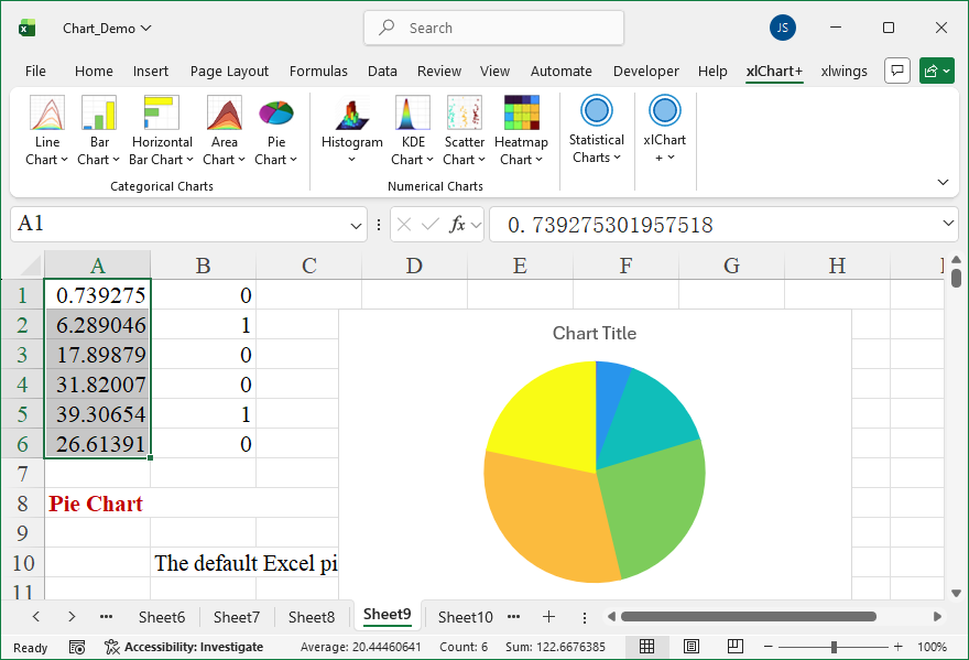
Click “OK” button.
You can change the colormap by selecting another item in “Select a colormap” dropbox in “Create a Pie Chart” dialog box.
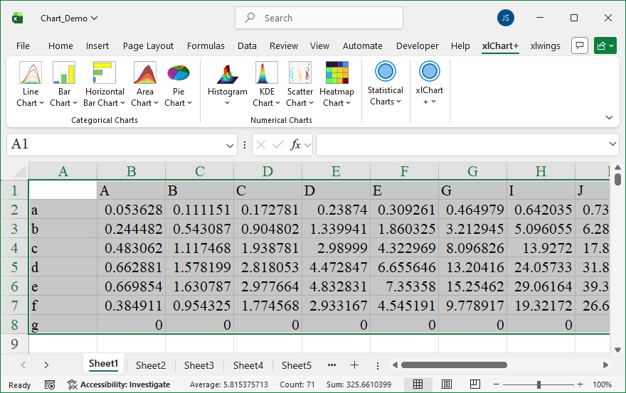
How To Create 3D Area Chart Using xlChart+ Add-in?
Flowing these steps to create 3d area chart:
First, select data in the worksheet.
Click “3D” item in “Area Chart” menu in xlChart+ add-in, open “Create an 3D Area Chart” dialog box.
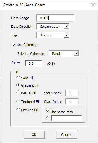
Click “OK” button.
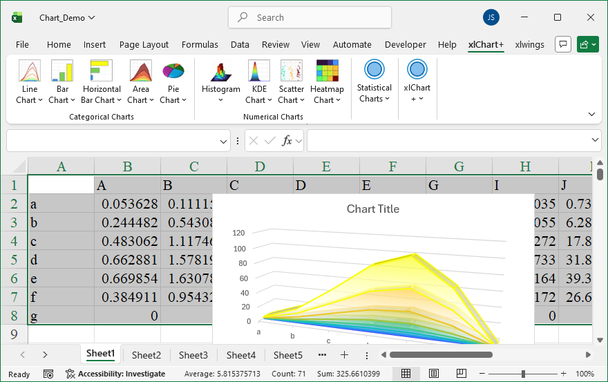
You can change the colormap by selecting another item in “Select a colormap” dropbox in “Create an 3D Area Chart” dialog box.
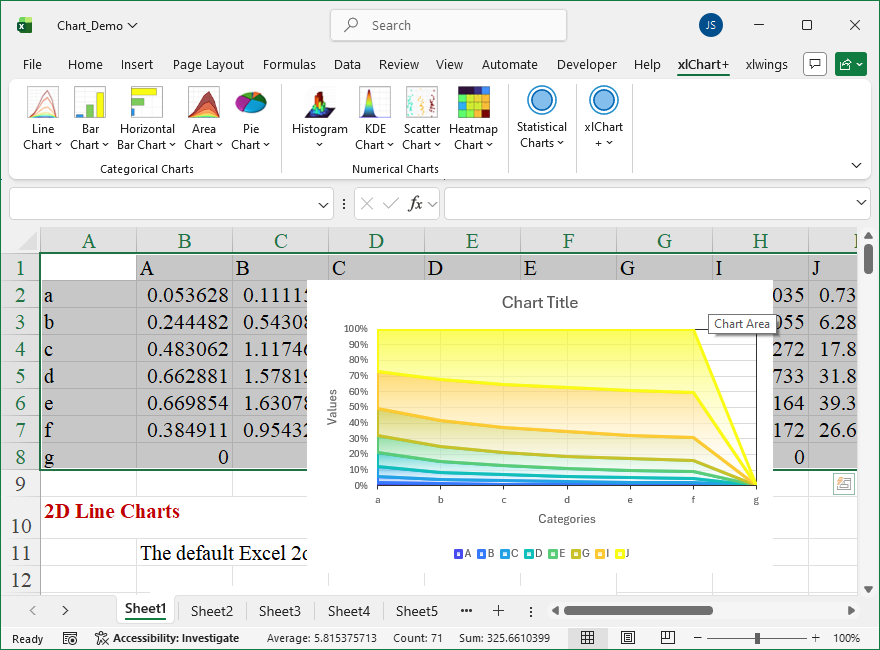
How To Create 2D 100% Percent Stacked Area Chart Using xlChart+ Add-in?
Flowing these steps to create 2d 100% percent stacked area chart:
First, select data in the worksheet.
Click “2D” item in “Area Chart” menu in xlChart+ add-in, open “Create an Area Chart” dialog box. Select “100% Stacked” item in “Type” dropbox.
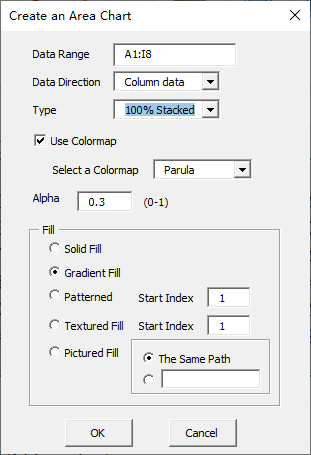
Click “OK” button.
You can change the colormap by selecting another item in “Select a colormap” dropbox in “Create an Area Chart” dialog box.